
The fighting game community(FGC) is a group of people from different ages, joining together to play fighting games. Their enthusiasm to get better and compete with top-notch players within their local community make their bonds stronger. Due to Covid-19 and funding, it has been harder to find local tournaments. Everyone has migrated their competitive plays online, but because of latency lag, it allows inconsistent tournament winnings and loses. I created this application to help players be able to find and create tournament events within their community once we are safely to do so.
UX/UI Designer
AdobeXD, Competitive Analysis, User Persona, Customer User Journey, Storyboard, Userflow, Wireframes, and Prototyping.
Feb - March 2021
.jpg)
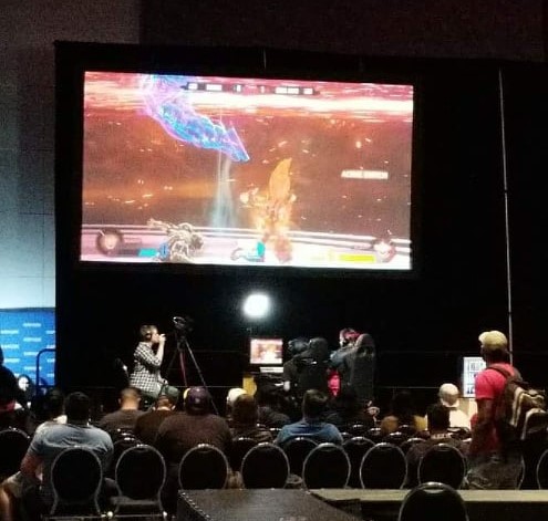


The first fighting game was created in the 1970s and 1980s, but what revolutionized fighting games was Street Fighter. Adding combos, techniques, chain attacks and strategic game play made players of different ages come together to test their skills. But you would think it's just a game right? Coming from someone who witnessed players competing at national tournaments, it's a different setting from other e-sport tournaments.
Games like FPS(first-person shooters), multiplayer online battle arena (MOBA), and other strategy games all use teamwork to coordinate and defeat their opponents. But with fighting games, you usually only competing with one other person. People gather at places like local eateries and venues like Golfland to play by using fighting game cabinets or by bringing their own setups.
Due to COVID-19 and not enough funding, it is becoming harder to find venues willing to host fighting game tournaments. On top of venue fees, players would have to also pay a participant fee. Players are frustrated because they can only compete online due to the pandemic. Online play has its issues because there's always chances that a player might have bad internet connection and cause lag.
In this portion, we want to conduct some research to see how we can understand the mindset of the players to see what they like and disliked about fighting game tournaments.
I conducted a survey with 35 participants to get an understanding of what players thought about their local fighting game tournaments. It ranges from players who play casually, players who enter tournaments, or are tournament organizers.
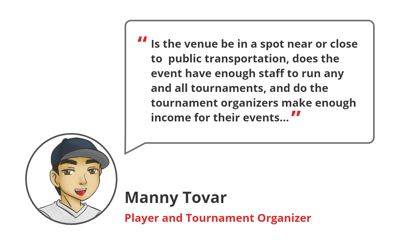
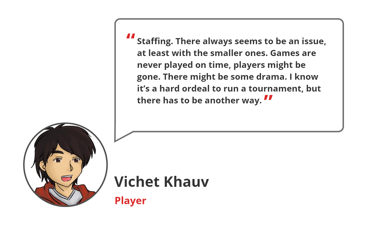
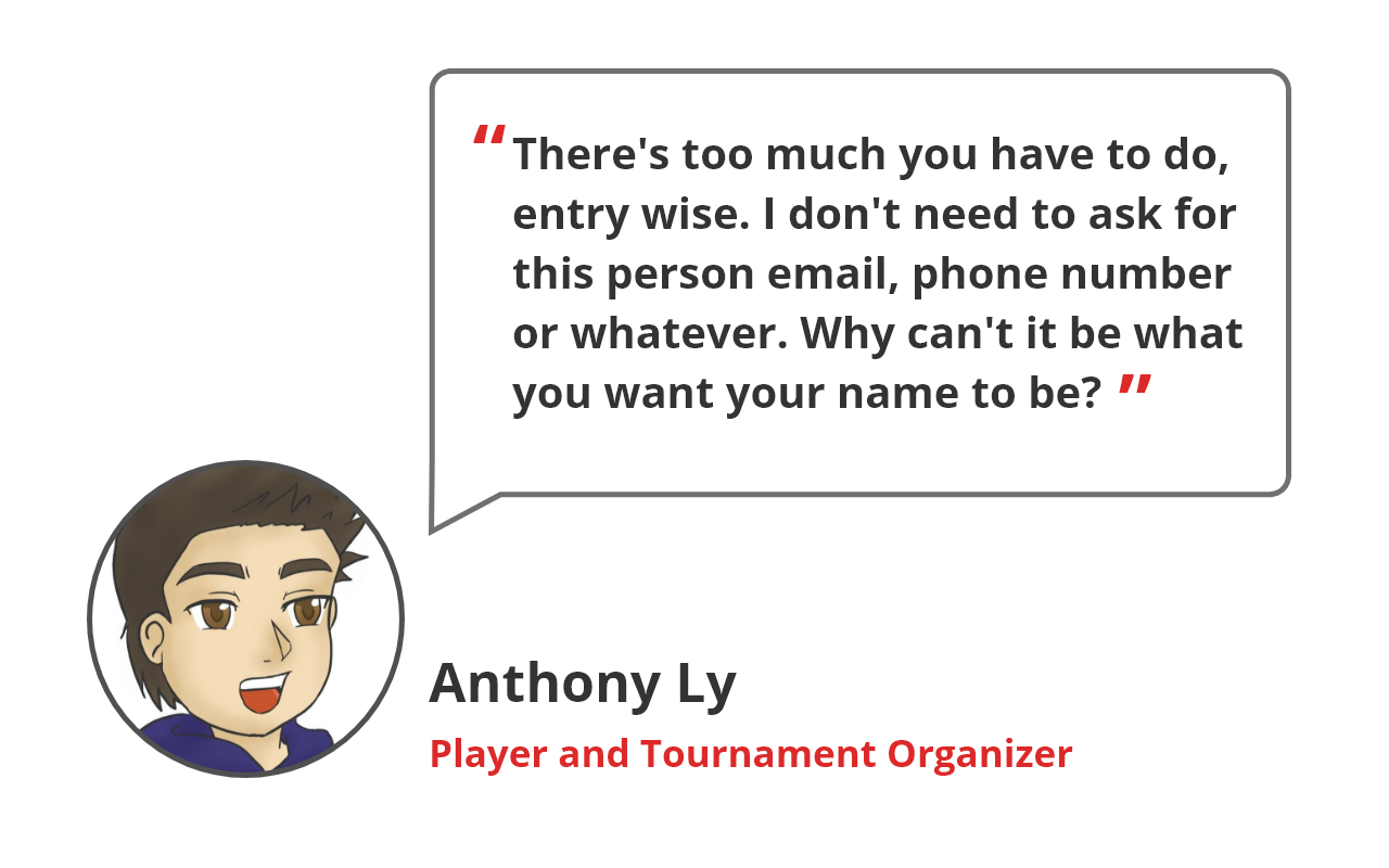
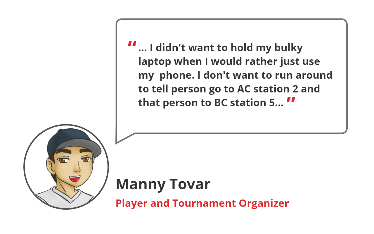
After reviewing the surveys, we were able to get an understanding of the players pain points of attending and hosting fighting game tournaments. Within the candidates, I interviewed 3 different users: one player and two candidates who are both a player and tournament organizer.
Key Findings:
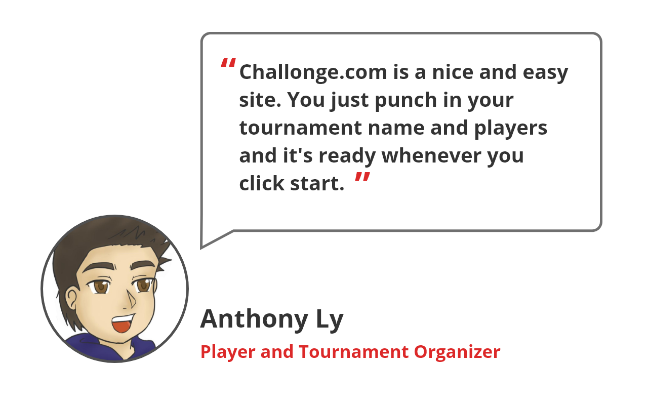
When I conducted the user interviews, they mentioned about the two event or tournament websites: Smash.gg and Challonge.com . Their website are made for e-sports community to join and create virtual or local events. I decided to create a competitive analysis to see what the pros and cons of using each website.
After analyzing the research from the surveys and user interviews, I wanted to get a deeper understanding on what our users would feel about attending and hosting a tournament. By creating an empathy map, I believe help me realize who are target users would be and how they would use our application.
%402x.png)

The empathy map was able to let me realize and understand what goals and frustrations of both a player and tournament organizer would feel. I created a player named Andy to represent a player who wants to join tournaments in his area to test his skills. While Matt is a tournament organizer who wants to start hosting his own tournaments in his local community. By creating a user persona of their issues and frustrations will help decide our problem statement and designs for our app.
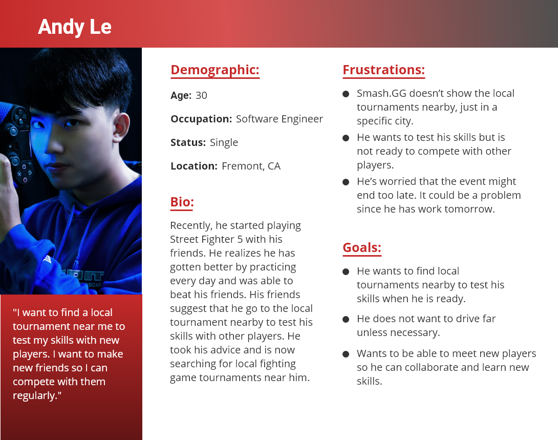
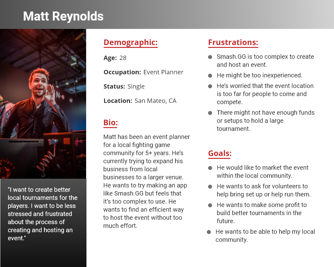
Players want to compete with other players to hone their skills, but the venues are too far. But tournament organizers can not host a tournament without funding or venue. Tournament organizers believe it is too much work to host an event alone, and other apps are too complicated to use.
I wanted to solve this issue by creating a mobile application that allows the players and tournament organizers have less frustrations with hosting and searching for tournaments.
The application should be able to:
How might we solve for problem for both Andy and Matt? It would be best to utilize both features of searching and creating for a tournament for the application. That way it solves both user problem.
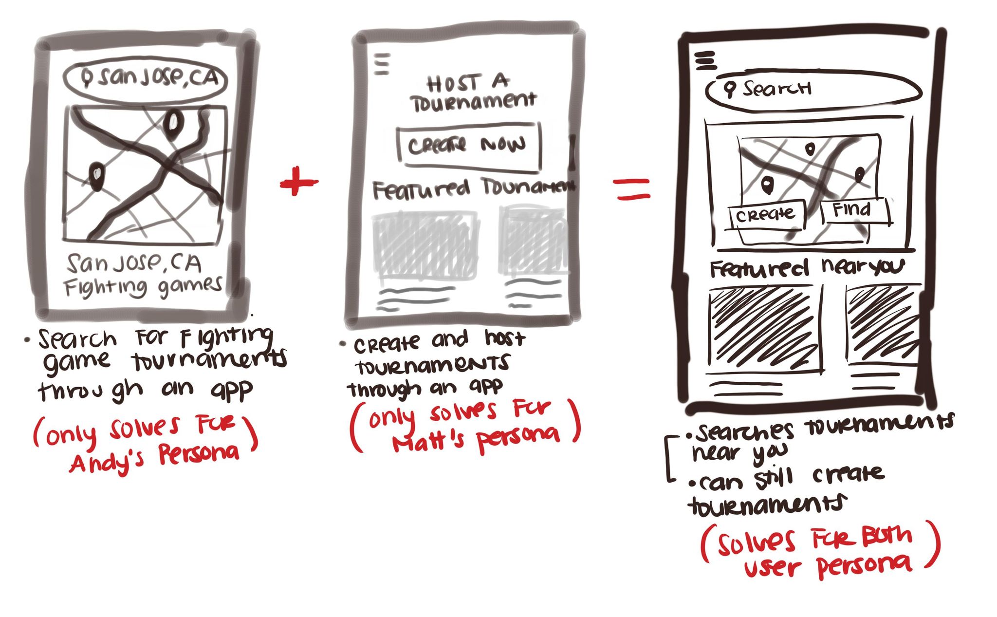
The brainstorming helped formulate some ideas of how the application should be. The user flow should help the user get to their goal of either creating/hosting and searching for a tournament. By keeping it simple, the user should be able to accomplish their user goal faster. I used the user interview to determine the frustrations of using Smash.GG and Challonge.com to reflect the user flow.
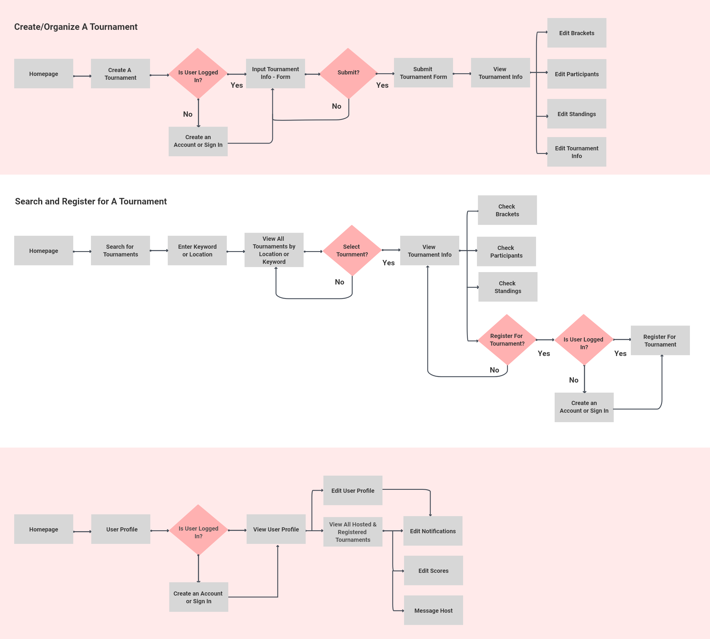
After reviewing the user flow, I wanted to create an informational structure since this was a newly built application. Creating a sitemap was used to get a general idea of how I wanted to form the application. It helped me realize how I should organize each content on each page.

During the primarily sketches, I wanted to focus on creating the tournament, searching, and displaying all the information. The homepage, search and the tournament information was the main sketches I focused on since it would be the most heavily used functions. Once I got the foundations I started to add more ideas into the low-fidelity designs.
.jpg)
.jpg)
.jpg)
.jpg)
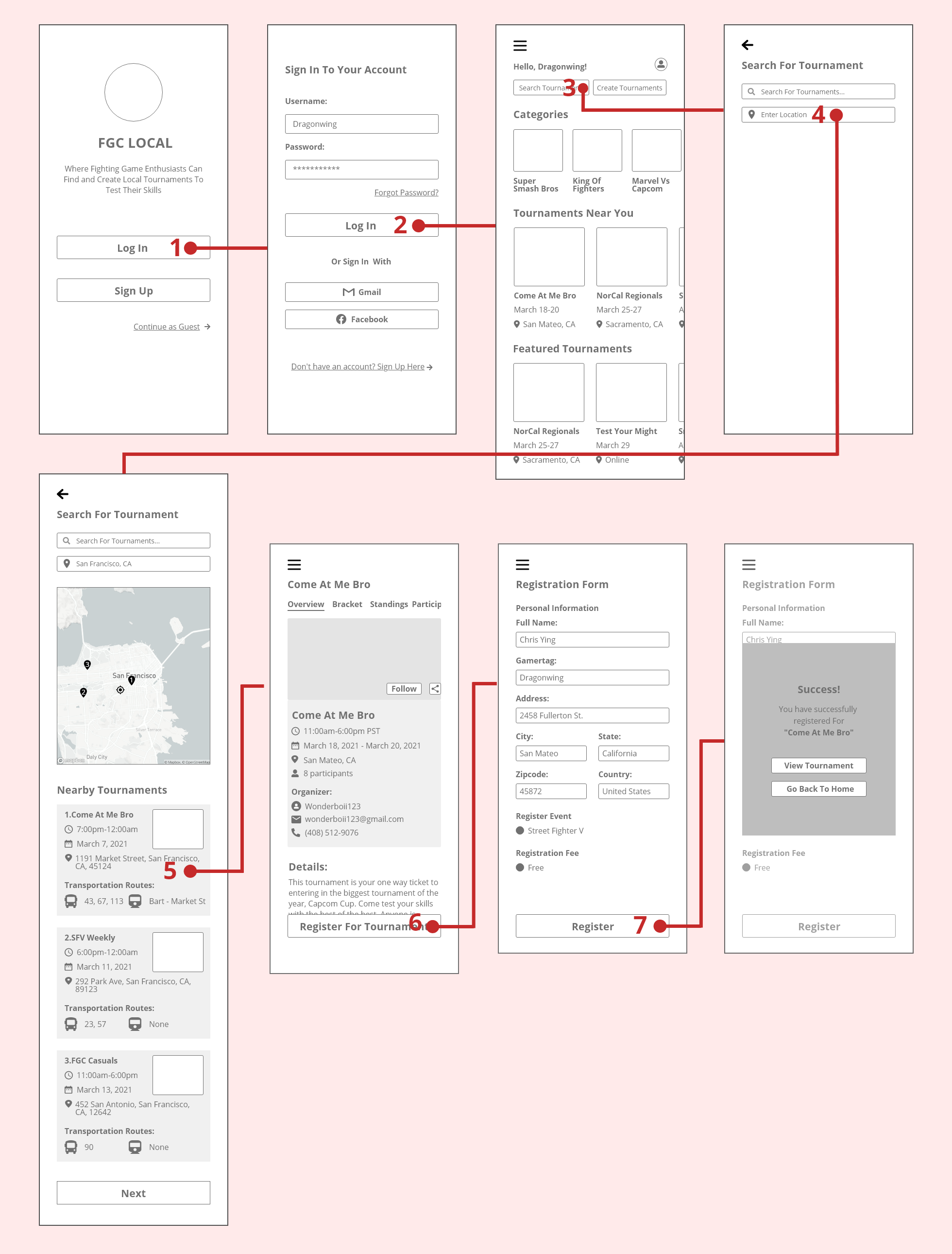
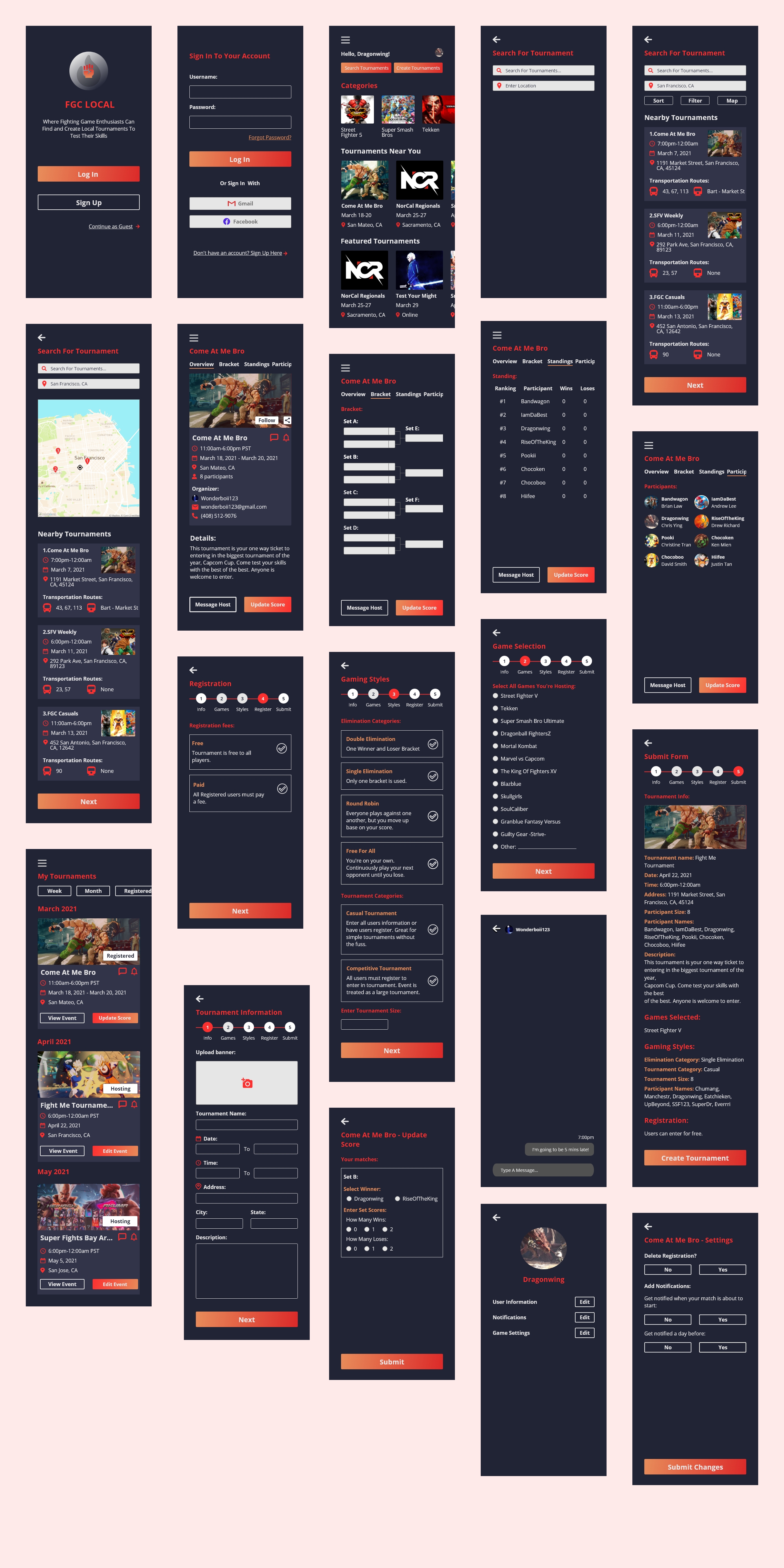
With the sketches, I was able to create a low-fidelity design for the project. I designed more screens to represent the flows from the sitemap and user flow.

With my user flow and sitemap, I only focused on three criteria's at the time: user profile, search, and creating a tournament. As I was creating the low fidelity designs, I created more screens to emphasize how the user interacts with the application overall. Although it was a lot of work, the usability testing allowed me to see what worked and didn't work in all the low fidelity designs.
Feedback:
1 out of 4 users thought it was difficult because the CTA button was not visible due to Maze.design having technical difficulties.
Feedback:
4 users who completed the task gave a 5/5 star for easy task to accomplish.
1 users had difficulties seeing the call to action button due to bug in MazeDesign App.

Feedback:
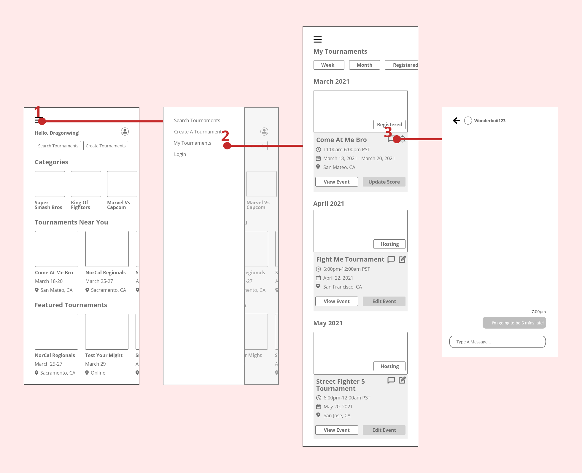
1 user did not understand the question and went to the user profile instead. I gave users more options to either update notification by going to the user profile, my tournaments, or the tournament details page.
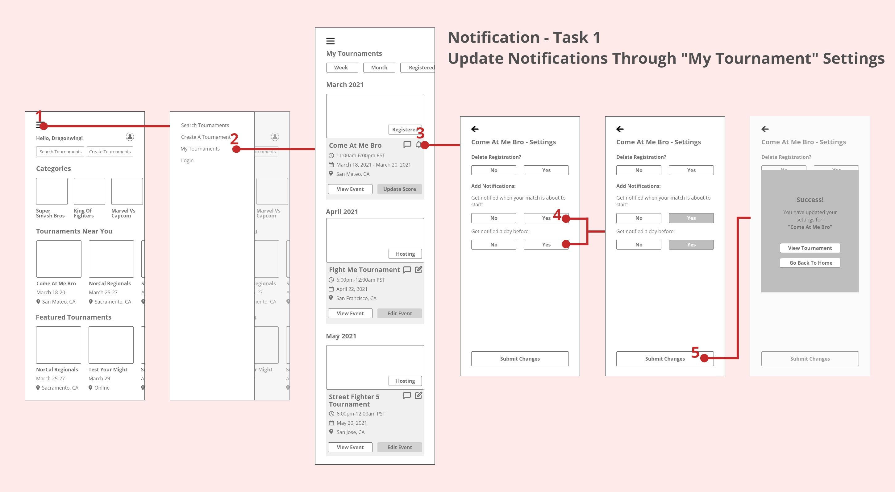
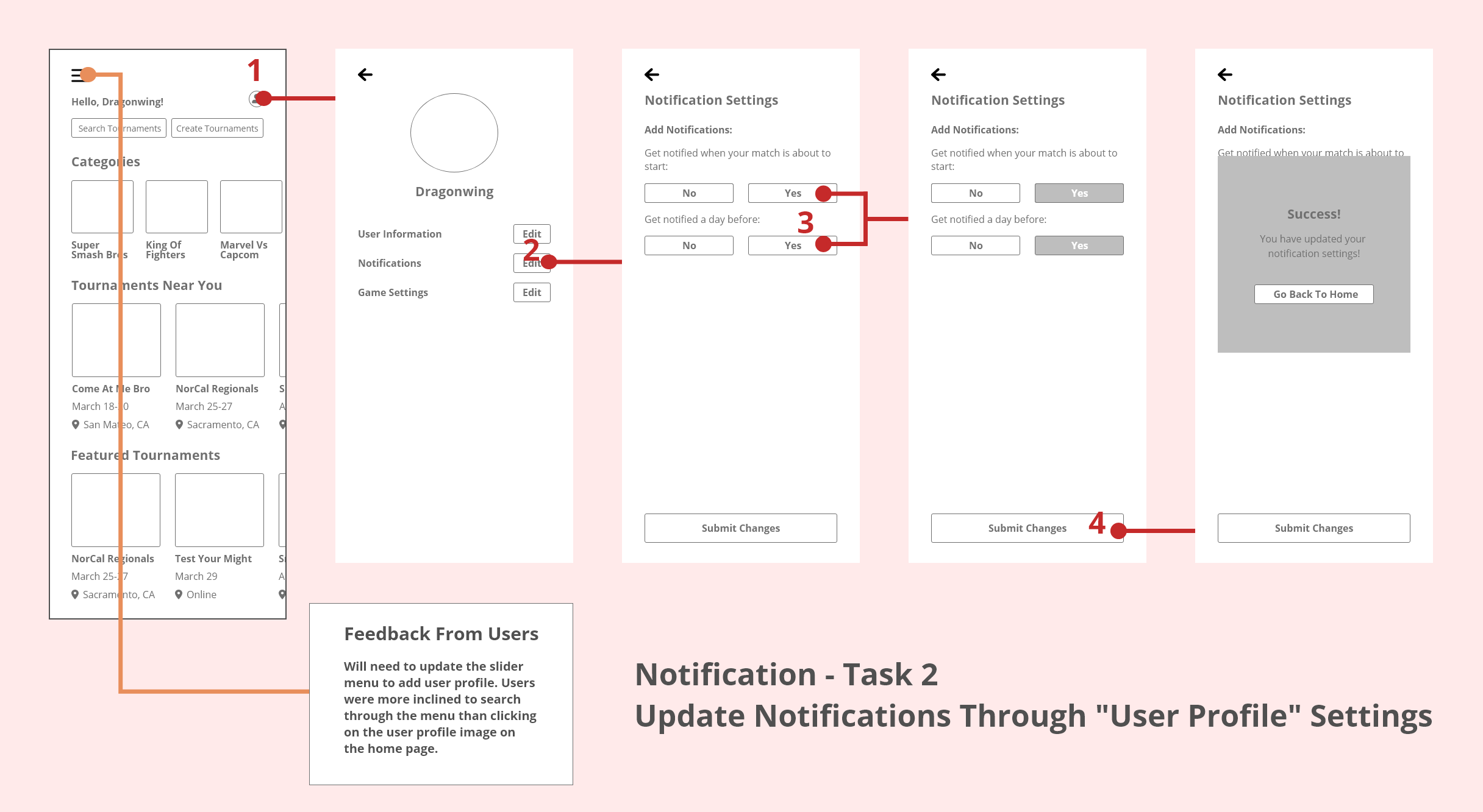
For the second task - Users need to go to their "User Profile" and update notifications.
All users were successfully able to pass the test but the key problem I noticed was that the 3 users that had indirect paths would select the side menu to go to "user profile".
Feedback:
I think a good option would to add the option to "Update Score" through the slider. Once the user selects this option, a user can choose which tournaments they have registered and update their score.
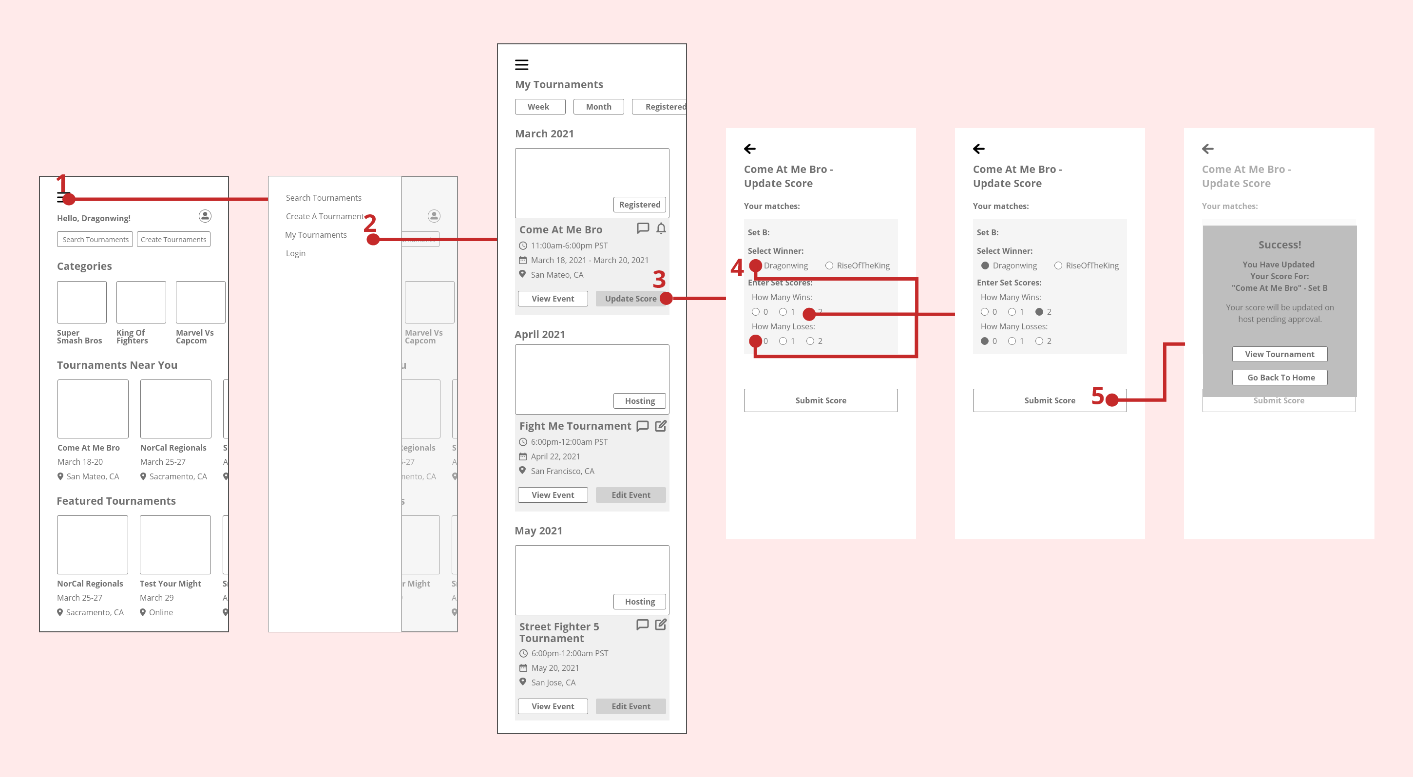
All users were able to complete this task with ease. I did have one feedback where a user mentioned that there should be an option to message the tournament organizer and the host. This would make sense because there could be multiple tournament organizer for one event.
Overall, this project was able to capture all the problems that I wanted to solve for the users of this application. Based on the usability testing, it seems that users had less of a struggle to creating a tournament and mentioned that it was very user friendly.

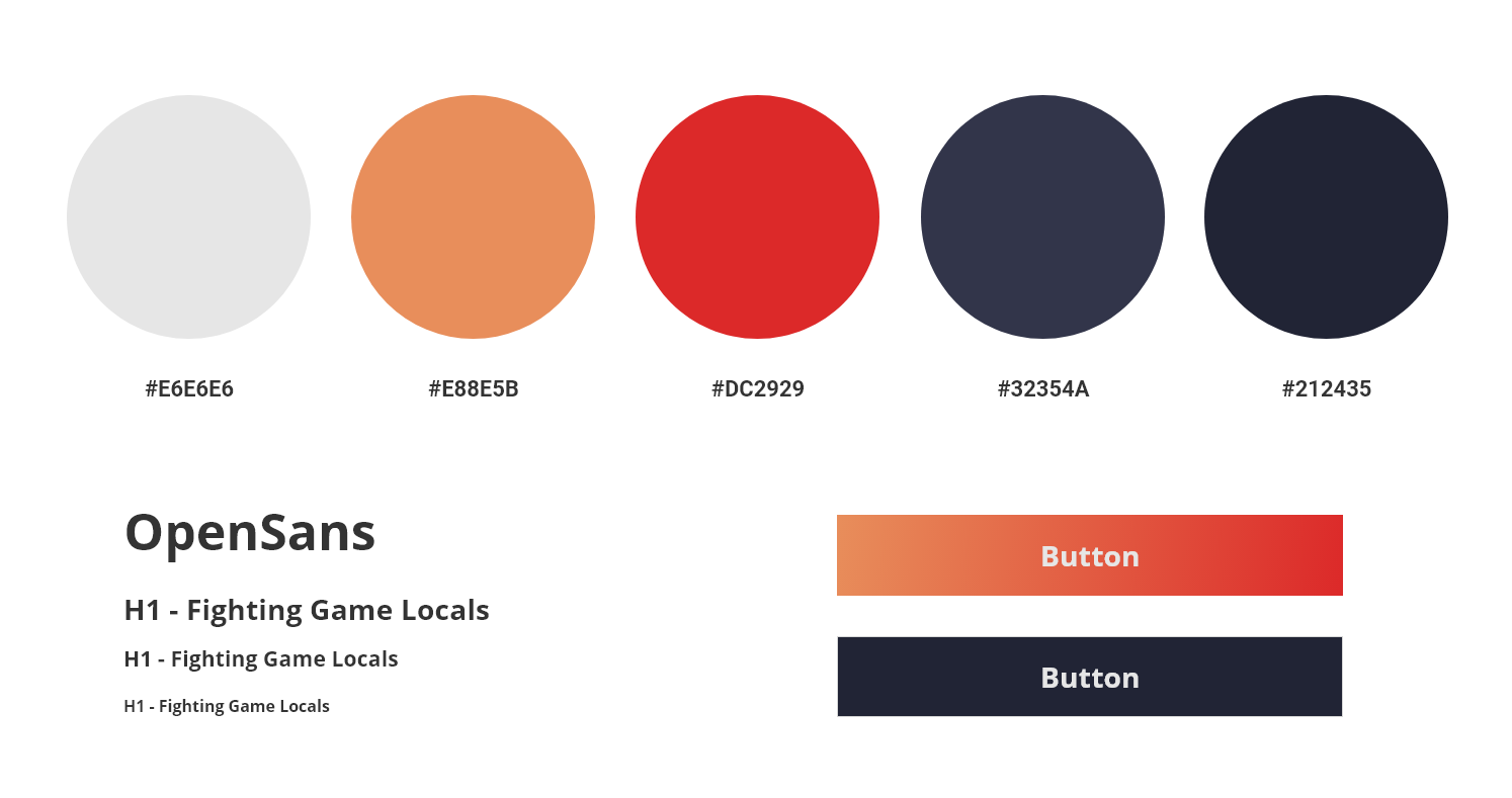
I went for a dark theme to have a better contrast of the bright orange and red tones. Plus the dark theme would be helpful to reduce eye strain.
The red and orange colors are commonly used in fighting games to emphasize energy, health and power. Thought it would be a good way to emphasis this in the color palette. I also wanted to incorporate a bit of blue but it would not go so well with the bright orange and red tones. So I thought adding a blue hue to the dark theme would be a good way to incorporate the color
Using the gradient orange and red was a good way to emphasize the call to action button. While the lesser important buttons, I left it as a white highlighted border. I originally wanted to give a white background to the non call to action buttons, but I didn't want to overuse too many colors.
Using the gradient orange and red was a good way to emphasize the call to action button. While the lesser important buttons, I left it as a white highlighted border. I originally wanted to give a white background to the non call to action buttons, but I didn't want to overuse too many colors.
Although I had one problem in mind, I learned that there can be a wide variety of problems that need to be solved. With the FGC, there's a lack of help to create new products to help players and tournament organizers. We can solve different problems with untraditional users that you commonly see for example: food or delivery apps. This is why gaming is becoming more involved with UX research because there's so many areas that we can help the players overcome simple tasks.
I also learned that Maze app can be a bit difficult to use with testing applications. It has not integrated well with AdobeXD due to limitation on functions. Some of my tests weren't accurate because people couldn't find the button to go to the next step. It would be more helpful to have more usability test done through in-person or zoom calls.
I learned a lot by creating this application. It was fun to do because I had a passion of learning more about the FGC community. I wanted to create this application to help propose more help in areas that we don't normally see or focus on.
Creating this application was indeed fun and I enjoyed every aspect of the research and design phases of this project.
Send a message!