Daiso is a 100 yen franchise shop that originated in Japan. It has over 100,000 products that range from a large variety of items such as household, kitchen, clothing, stationery, and other home goods. It has become so popular that it has expanded to different countries across the world. Daiso is unique because you can find everyday items for the reasonable starting price of 100 yen(equivalent to $1.50 in US currency) and up. The only problem is that the customers have a hard time searching for the items that they need. Daiso merchandise consists of non-American brand items in which may confuse shoppers.
How can we make searching, requesting, and purchasing merchandise simpler for customers?
UX/UI Designer
AdobeXD, Competitive Analysis, User Persona, User Story, Storyboard, Userflow, Wireframes, and Prototyping.
June - Dec 2020
Daiso has become such a large company that it expanded to many countries, including the United States. Although their Japanese markets are thriving, the US market is suffering in sales. The US is unavailable to meet the demands of its customers due to limited item availability from shipment.
Using my previous knowledge as an employee and customer's perspective from user surveys, I will demonstrate some issues noticed at the US Daiso store locations.

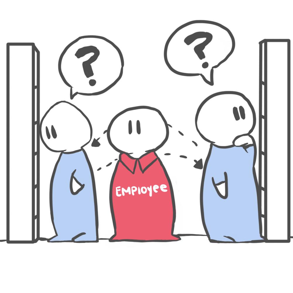
The employees often glance at the top shelves or backroom if there's extra stock.

Often the employee would check the backroom and shuffle through a new and unorganized shipment.

They would have to check the warehouse inventory on whether the item is available to be ordered in the next shipment.

If the previous options fail, the employee must call the other store locations to confirm if the item is in stock.
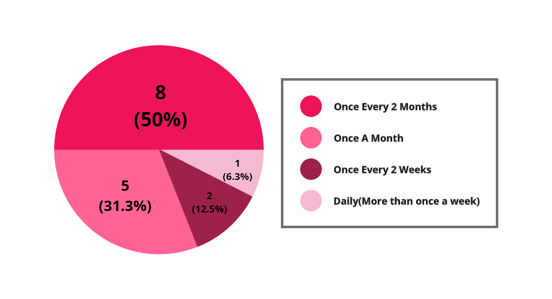
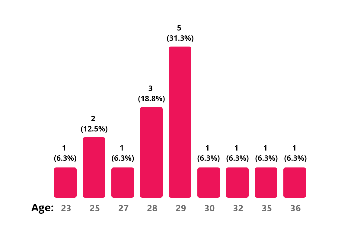
35%
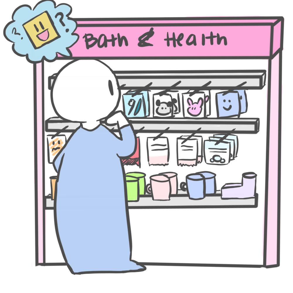
of users disliked when an item is out of stock. They also disliked how the store was unorganized or unable to determine when it will be available again.
The users on the survey believed that theirwebsite lacked functionality. Users could not find items that they needed because thewebsite was unorganized to navigate through.
Daiso Japan currently does not have a mobile application but an online store that allows its customers to purchase bulk items. I compared a few websites similar to Daiso that generally have a market that sells dollar items: DollarTree and FamilyDollar. I also included another Japanese competitor that's similar to Daiso called Miniso. Miniso has a similar marketing style to Daiso but has a higher selling value.
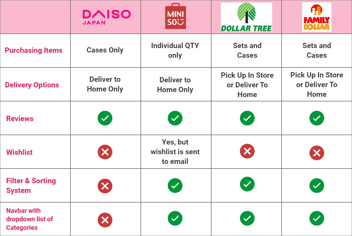
Based on these observations, it seems that Daiso is missing some components compared to its competitors. Having different options for their customers allows for a better experience. We'll take these components and reflect them in the design.
He is more likely to familiarize himself with the store before asking an employee for help.

If he couldn't find the item that he needed, he would drive to another location. It is unlikely for him to go to another store if he couldn't find it at the previous store.
The only reason why he could not find an item was because being placed in a different location. When an item is not in eye-level view, he is most likely to miss it if he's in a rush. Another issue is when anaisle is not clearly labeled.

After conducting the survey and user interview, I wanted to illustrate customer and employee interaction. The steps mentioned below are a scenario when the customer finds out an item is unavailable. If an item is unavailable, the customer seeks out help from the employee.
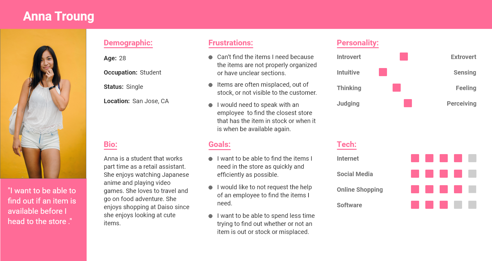
With the research and the storyboard combined, I came up with the user persona, Anna. Anna is a customer at Daiso and often goes there to buy and explore new items. Based on her goals, we created a user story of how she would interact with the Daiso application:
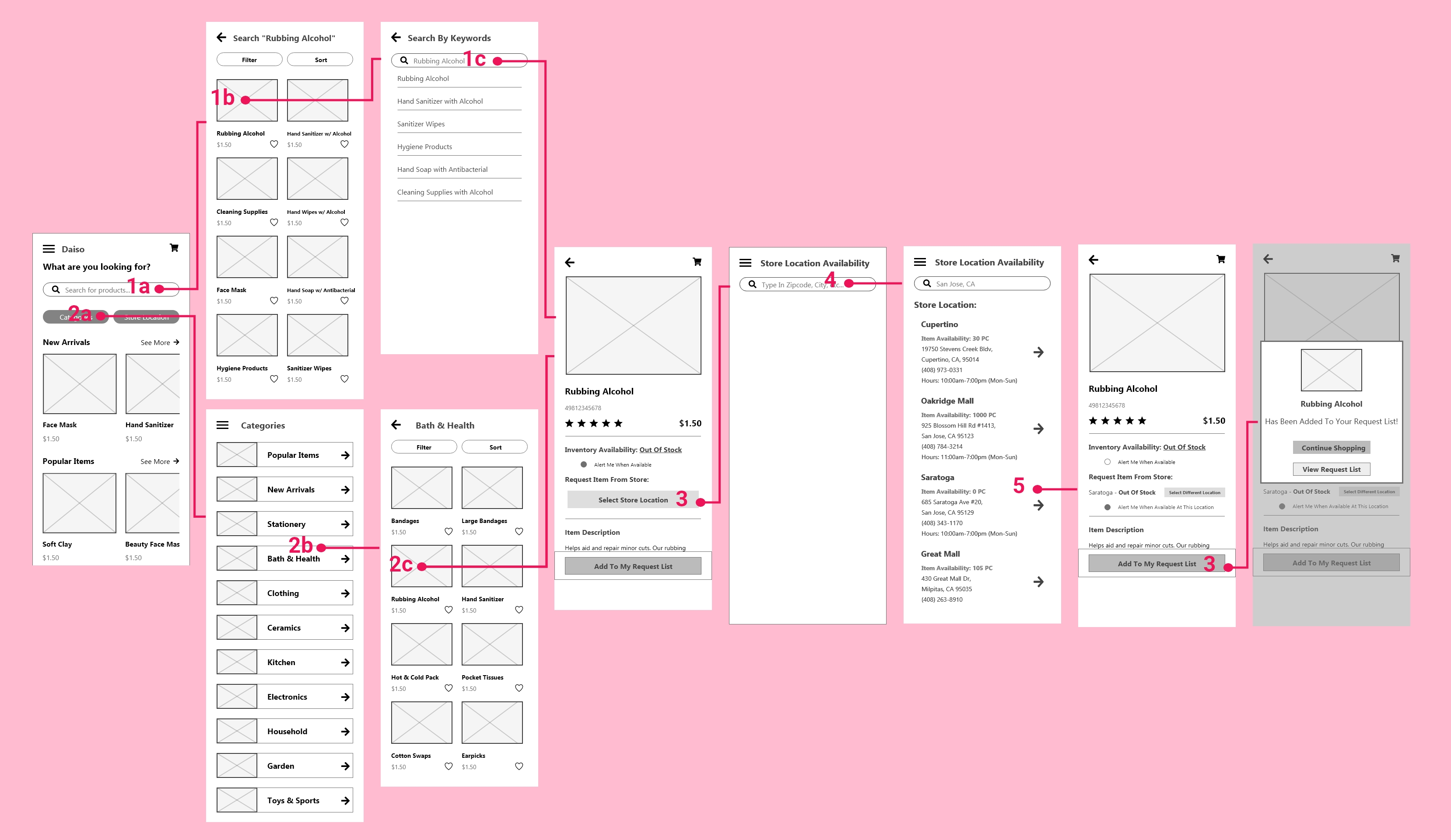
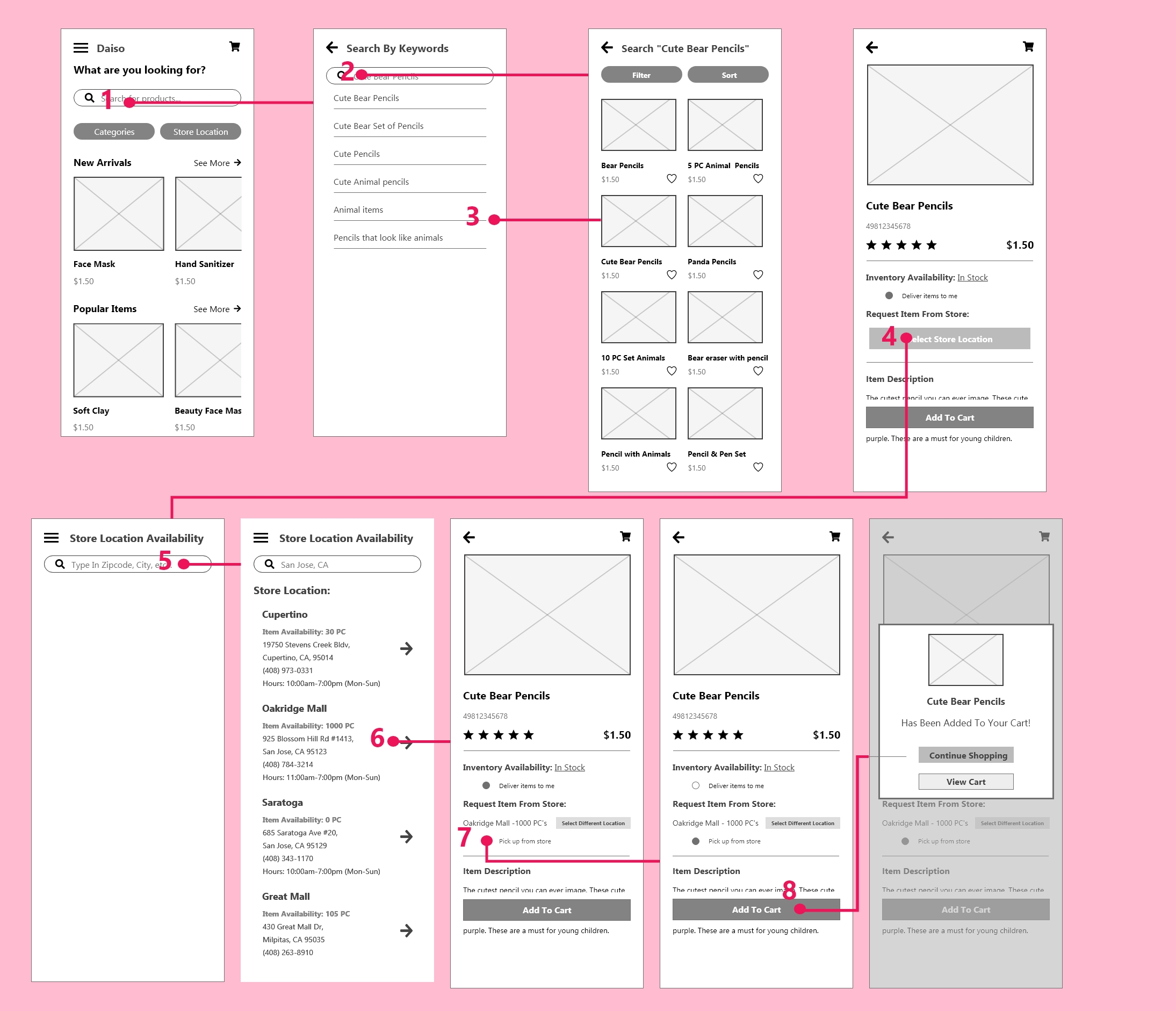
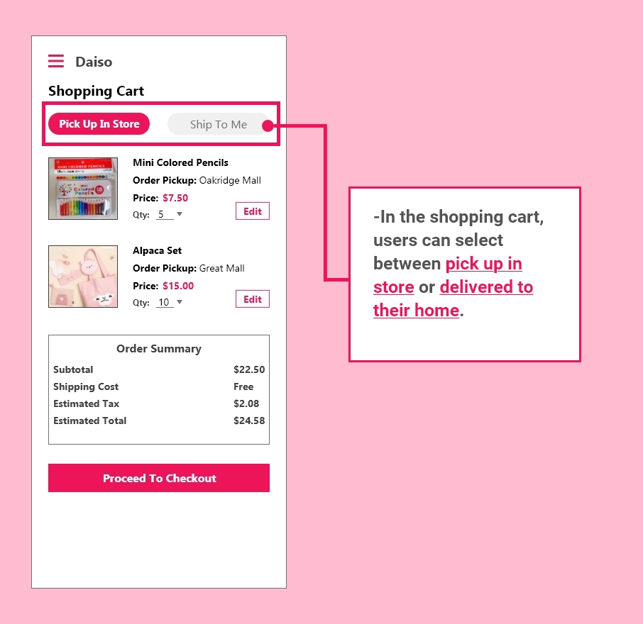
"As a customer, I want a search application, so I can find out whether or not an item is available to be re-ordered or purchased."
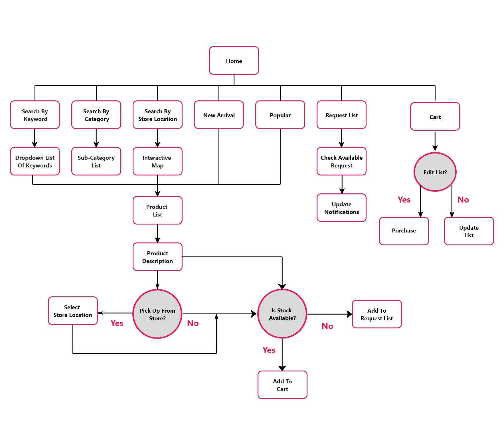
The sitemap above is what pages and interactions the user might encounter. The users should perform the following actions: search for items, how it's delivered or picked up, and if it is available. The user can request to have the item be re-ordered and received a notification when it is available. Compared to the other competitors we researched, they all do not have a request function. This functionality can help the customer feel more at ease when searching for an unavailable item.
Working at Daiso Japan for seven years, I learned to be empathetic to the customers and the employees. I want to create an application that helps customers purchase the items they want without relying too heavily on the employee. By creating this application, the employee can have fewer disruptions if they refer the app to the customers. The application should help users have fewer issues when shopping and find items that are available to them.
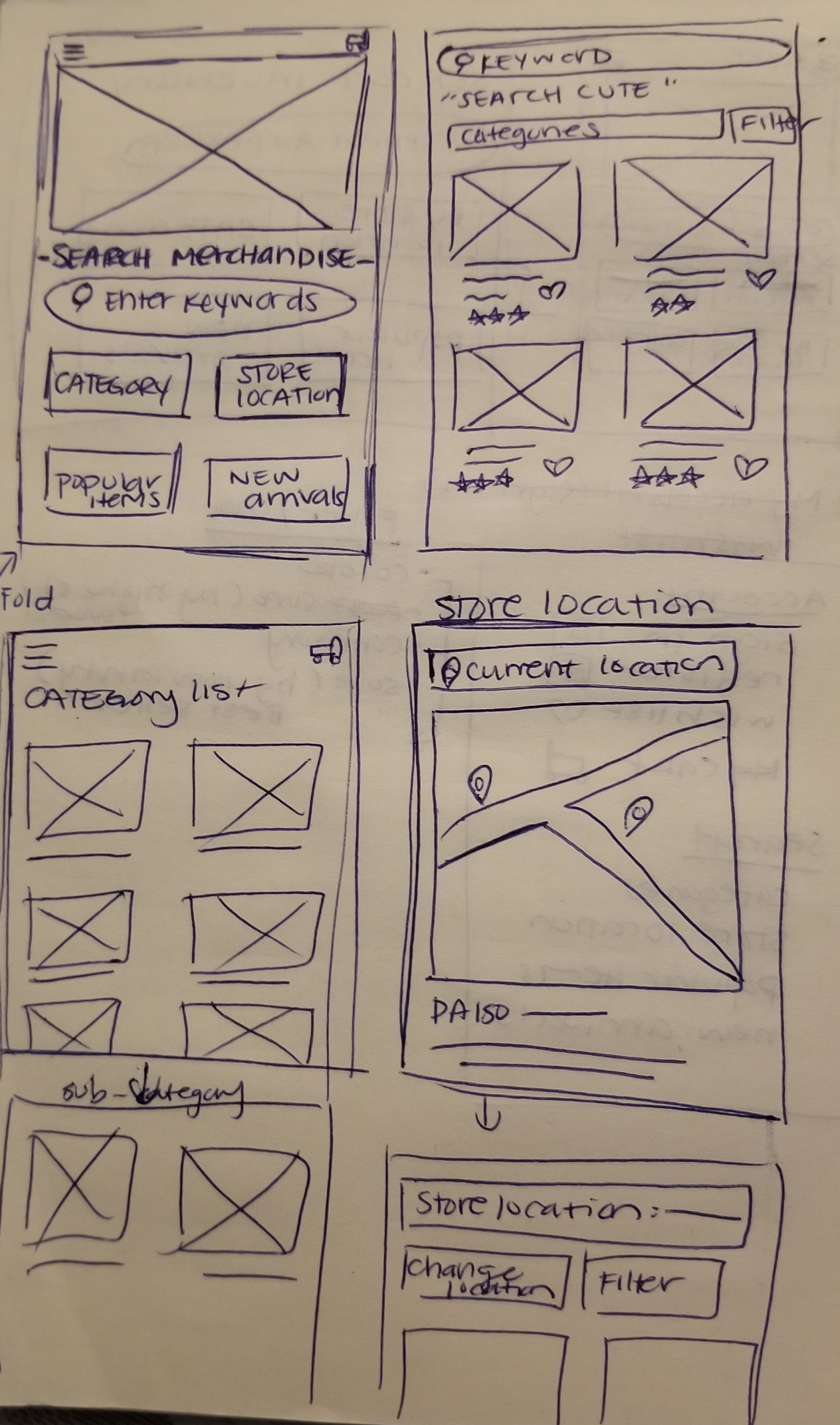
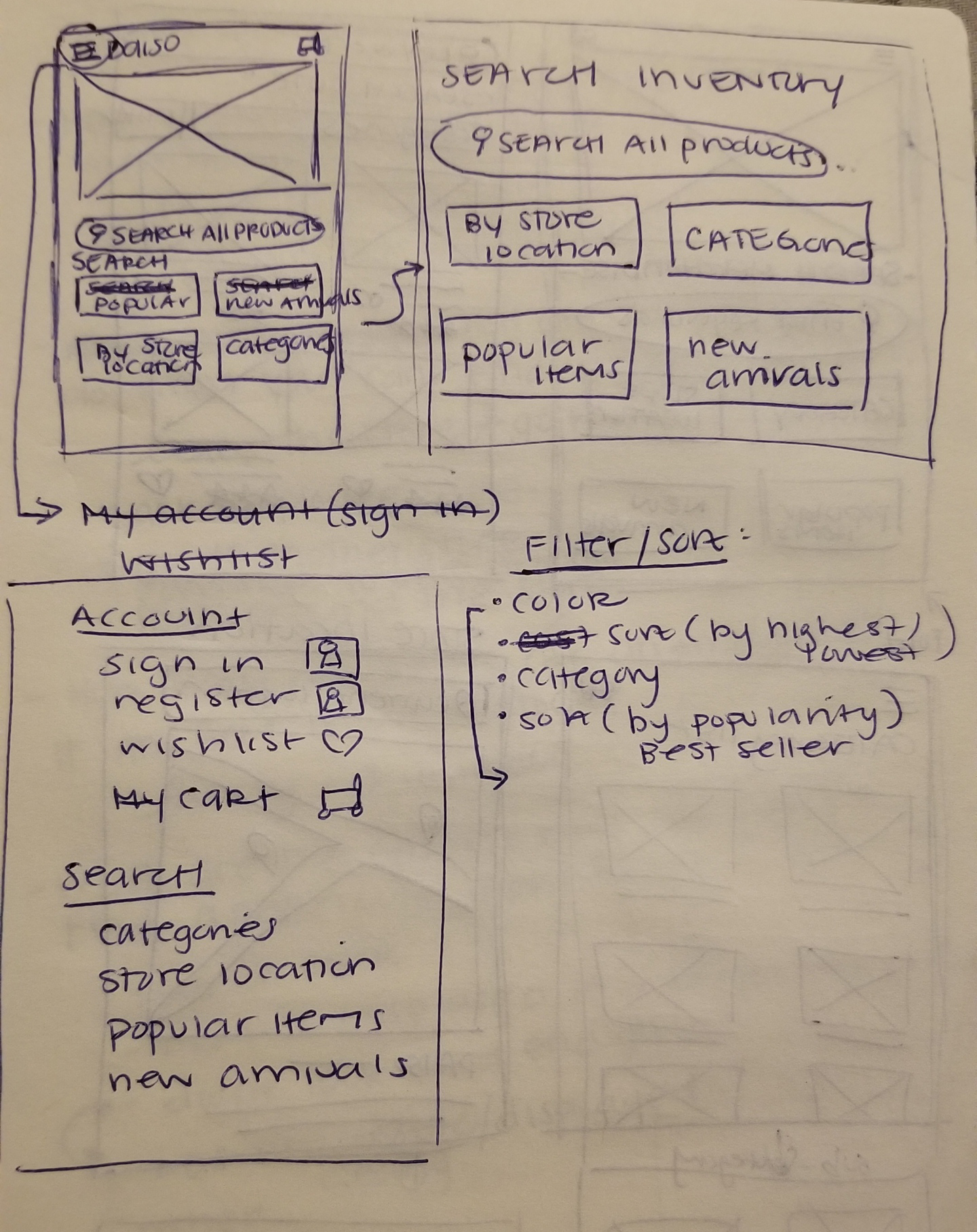
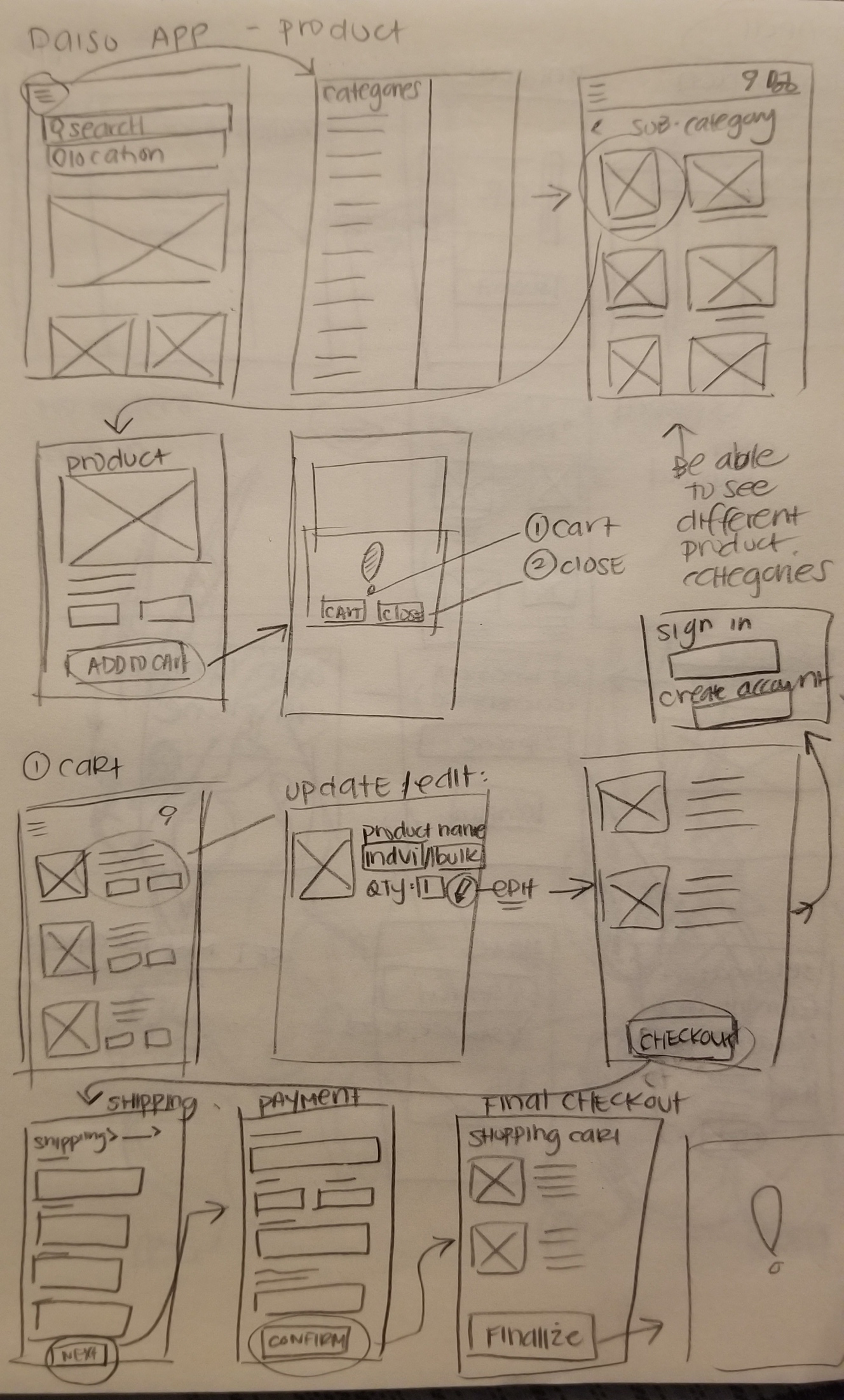


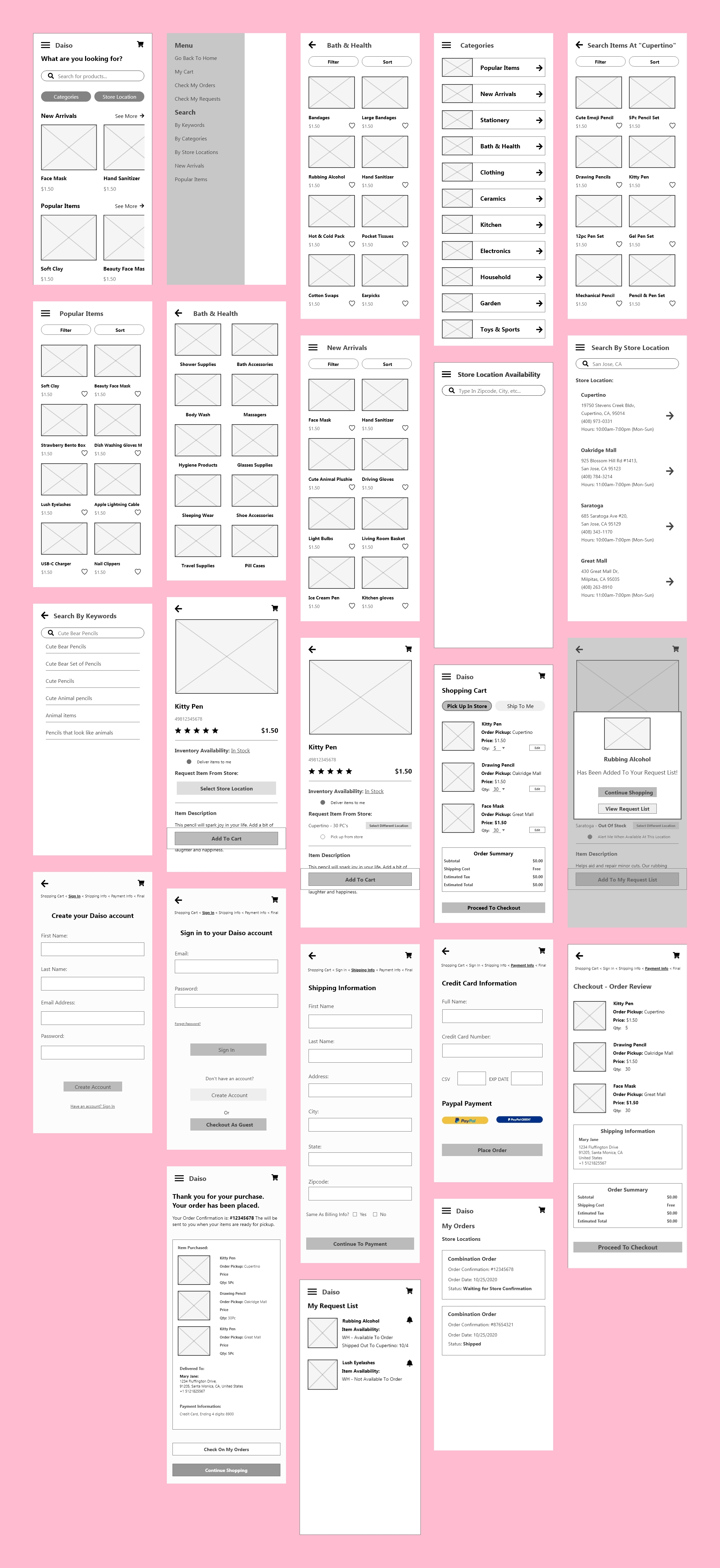
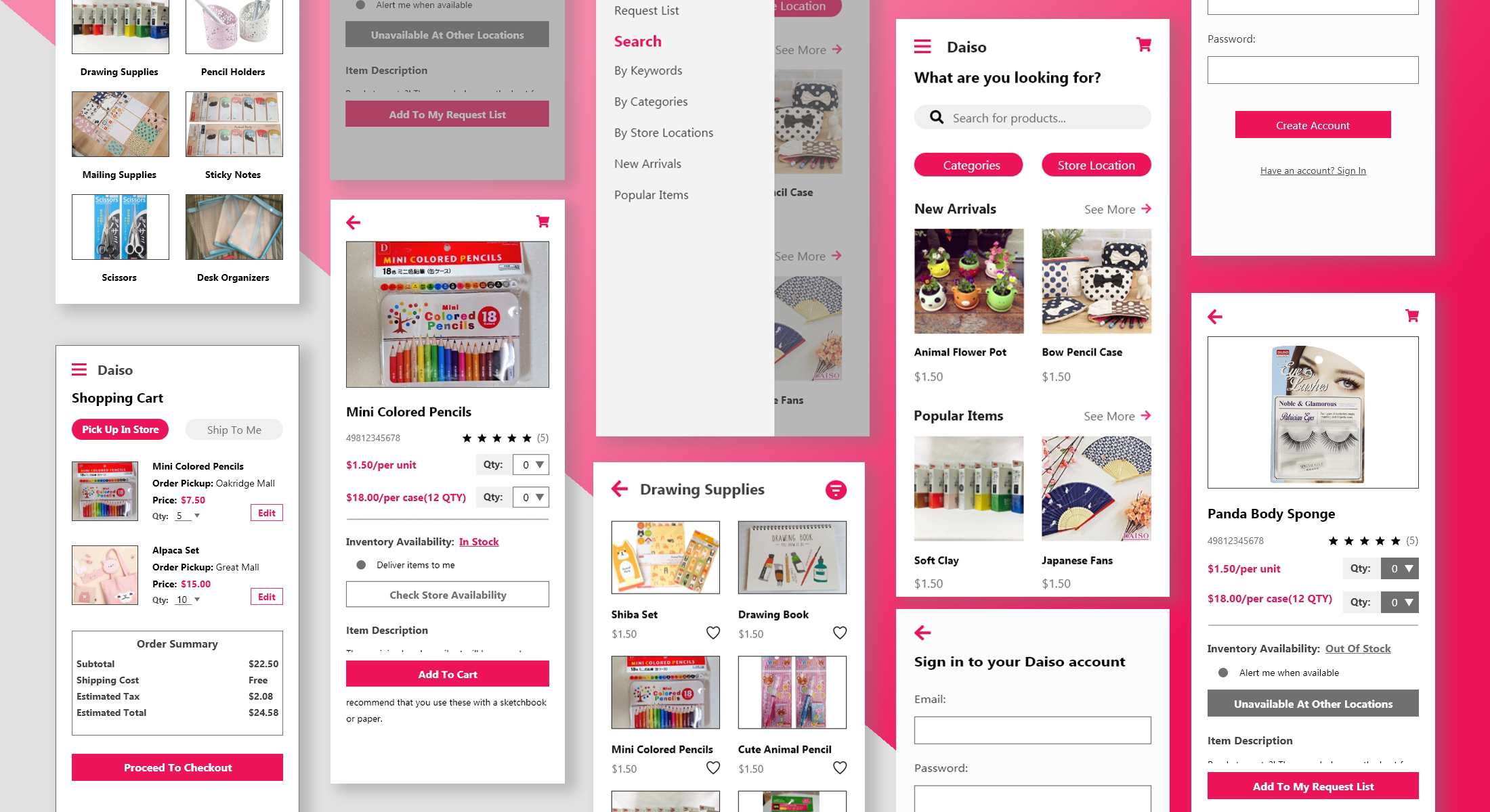
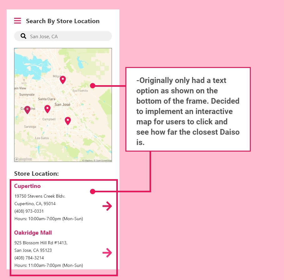
The first low-fi designs had inspiration from different e-commerce apps such as Amazon, Target, and Ulta. These apps use similar functions such as searching, shipping, and completing a purchase. I added three primary functionalities to the homepage: search through keywords, store location by categories.
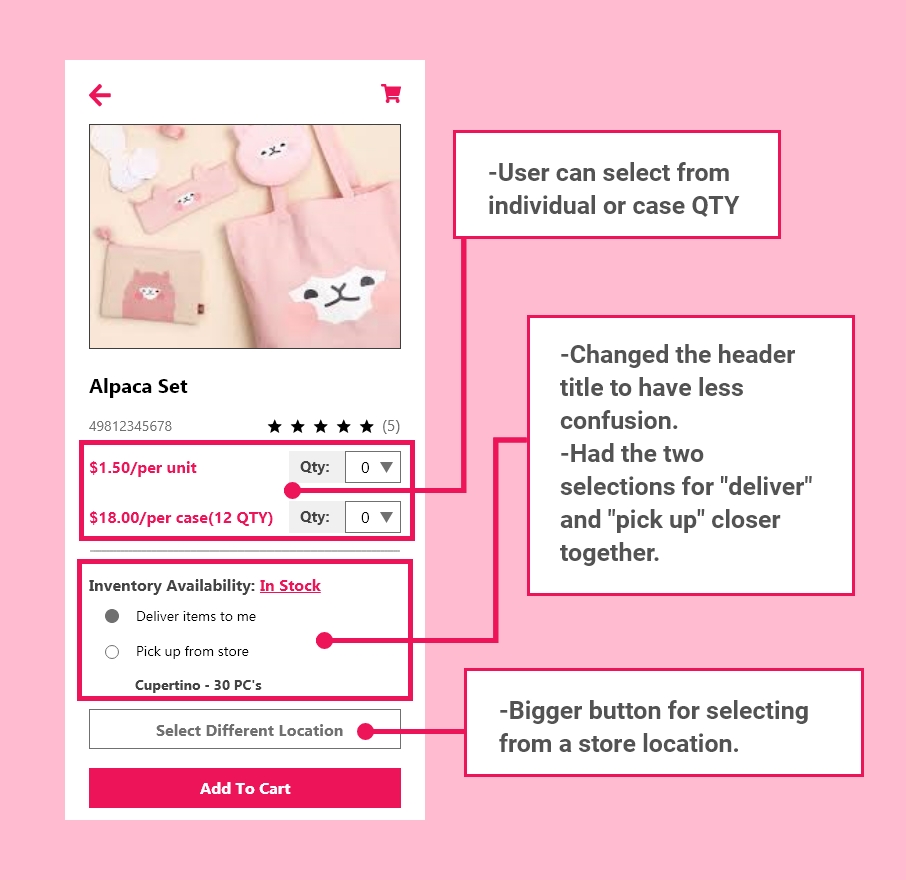
The user accomplished the task. The only feedback was on step 7.
The option "pick up from store" was not already selected when the user selected a store location. In the previous frame, the option "deliver items to me" is still highlighted. This change would allow the user to take one less click.
The user failed the task. The user did not know how to add the item to the request list from the store location.
The user accomplished the task with no issues due to remembering the previous task mistakes.

Pros:
Improvements:
I had created other tasks for the users but were fully not implemented. In the next design iteration, we added changes based on the user's feedback.


By adding the new features missing functionalities, it was time to test all the tasks. I used the usability testing app called Maze and tested the functionality of the app with five users. The users were able to complete them.
All users completed this task. The miss clicks happened at flow "4b", where the user would click on the area instead of the notification icon.

All users completed this task with no issues.

Although there were some setbacks, the results were as expected. From the usability testing, I learned some common trends that I did not expect the user to take:
Although this was my first case study project, I learned a lot from creating this application. It was a great learning experience to take user problems that I faced at my past job and showcasing in a working application. Some key features that I wish I did better:
Overall, I had enjoyed learning more about UX/UI Design with this project.
Send a message!