Bay Plumbing Inc. has over 20 years of experience serving customers in the Bay Area. They specialize in both residential and commercial projects, from drain cleaning to emergency repairs. Their customers have been gain through referrals, friends, and acquaintances. Wanting to promote their business, they constructed a website for their small business. Bay Plumbing Inc. has noticed their website has not gained much traffic throughout the years. Helping them redesign their website will help them gain new potential customers.
UX/UI Designer
AdobeXD, Competitive Analysis, User Persona, Customer User Journey, Storyboard, Userflow, Wireframes, and Prototyping.
Feb - April 2021
Bay plumbing is a family-owned business that has been around for 20 years. Although they have obtained many clients and referrals over the years, they came to me to improve their business market. They purchased a website to promote their business but noticed it has not helped them increase potential customers. After discussing the problem with the client, we wanted to understand what customers encountered when looking for plumbing repairs.
I surveyed 42 respondents from people who previously had or not had plumbing services done before. The surveys conveyed what type of concerns people had with wanting to hire a new plumber or service.
I interviewed three users to learn more about how users look for new service providers. During the interview, they revealed the pros and cons of their past services experience. Their opinions developed from prior service experiences such as health, home, and automobile services.
Key Findings:
“If it breaks down 3 months later after the service, then we know they did a bad job. Especially when we didn't even know what they did, which may lead to other problems...”
-Julie Nguyen
“With a plumbing service, a lot of people don't know what pipe does what. I don't want to get someone who does ‘I fixed everything, but I also did XYZ. Because I did XYZ, the quote would have been $50, well it's now $200.’ I didn't ask you to do that, and you never disclosed that information to me.”
-Terry Lee
After conducting the user interviews, I wanted to see the pain points users encountered when navigating through Bay Plumbing Inc's website. The website currently has a homepage, about us, services, gallery, and contact page. With the usability testing, I would hope to recognize where to make improvements for each page.
The main problem that resulted in the usability testing was making sure that the company had more reviews.
Key Findings:
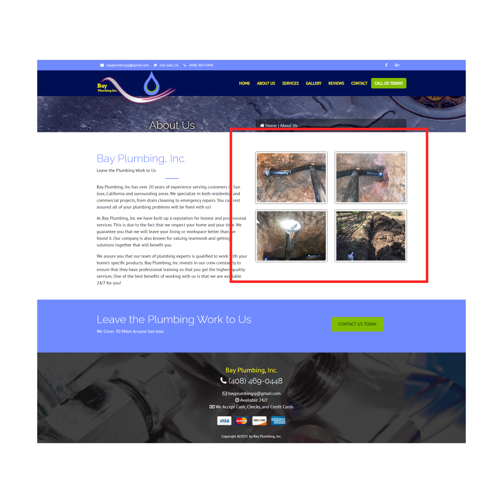
Having a picture of the company's trucks or the employees on their about us page would make them look trustworthy.

They liked how there's a contact us button throughout the page. As they scrolled through the different pages, they were more inclined to click on "Contact Us" right away.

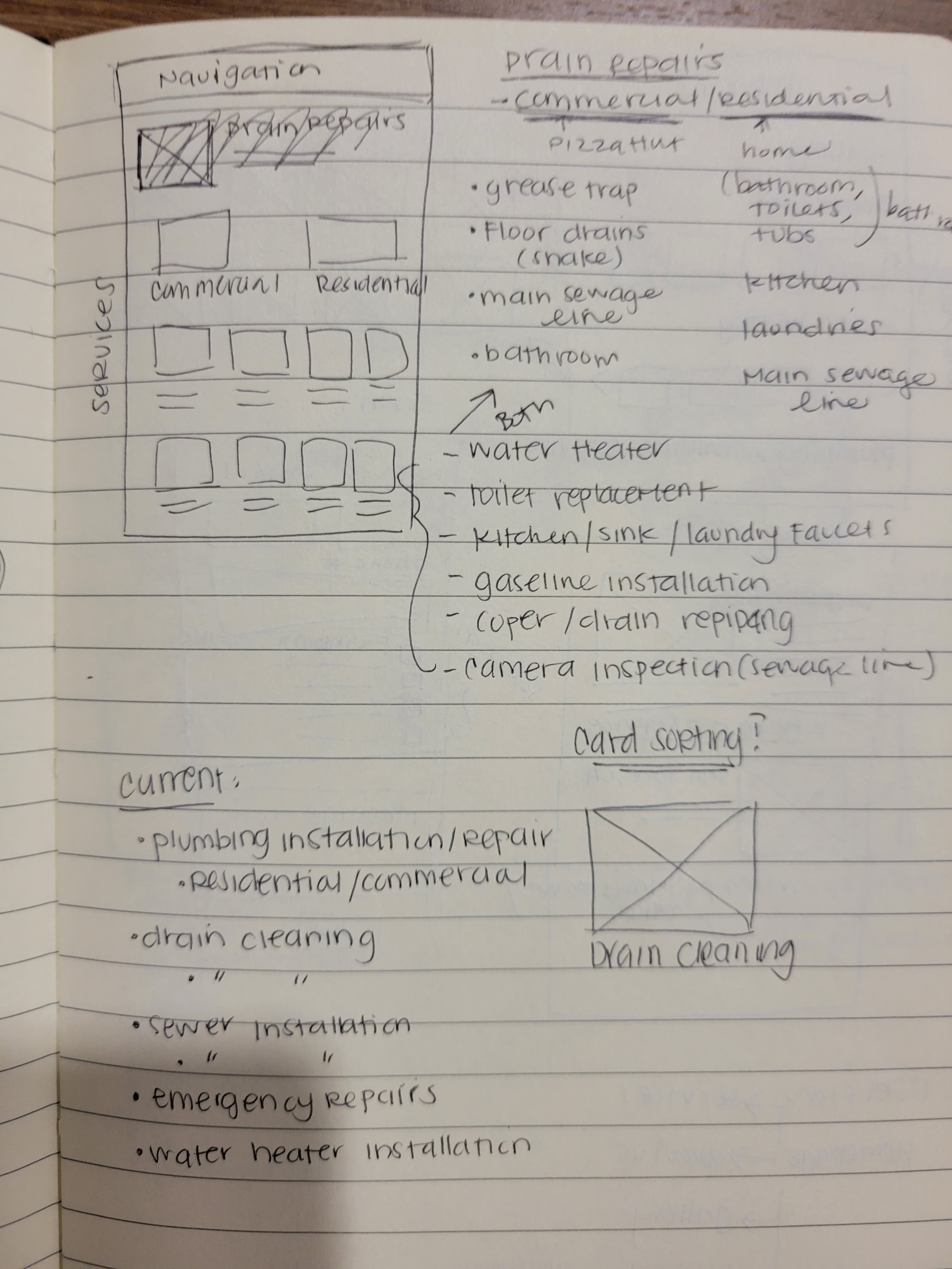
Changing the gallery section to a carousel or adding headers of each type of plumbing service would make it pop out. They currently have a collage of images of their previous work.

One user suggested that there should be more reviews on their website. Since they have been in service for 20 years, they thought there would be more reviews.
I compared various plumbing websites by searching the keyword plumbing. The purpose was to compare what each website should have on their service provider website.
Based on some of the competitors I have chosen, most of the websites have similar functionalities. I decided to take a look throughout their website to see what features they have on their homepage.
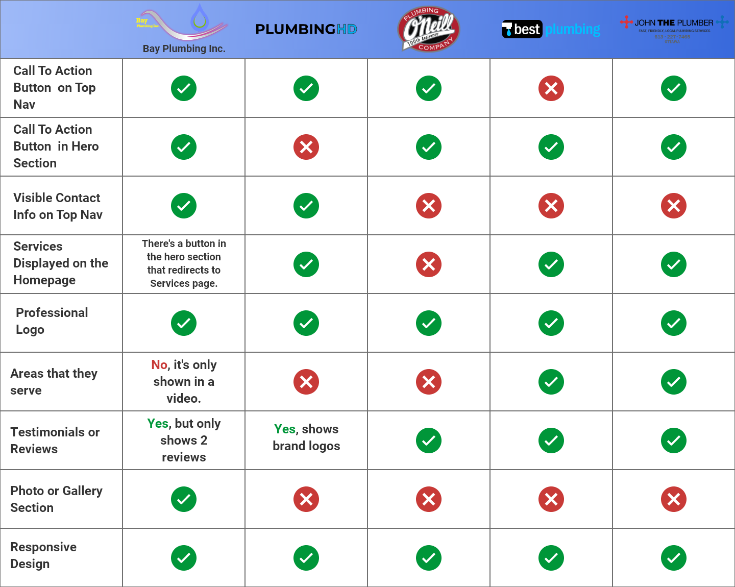
After creating the competitive analysis, I was able to analyze some key features that stood out. Using these key features would be beneficial to attract users to contact Bay Plumbing Inc for their services. I wanted to take these key features and display them on the homepage to earn the trust of our customers.
One website had a review section on its home page which will help represents trust with potential new customers.

Emphasizes their main points of why you choose them: "Clean, Fast and Reliable." They also mention other phrases such as 24/7 Emergency Service, Web services, and Live Associate chat.
The surveys and user interviews helped with discovering some user pain points and feelings a customer may experience. After discussing these pain points with the client, I proposed who their potential users would be.
In the example of the empathy map above, we chose to look into a couple who lived in apartments based on the information we gathered. We came up with an example case where a user needs to find a new plumber to repair the drain in her kitchen sink.
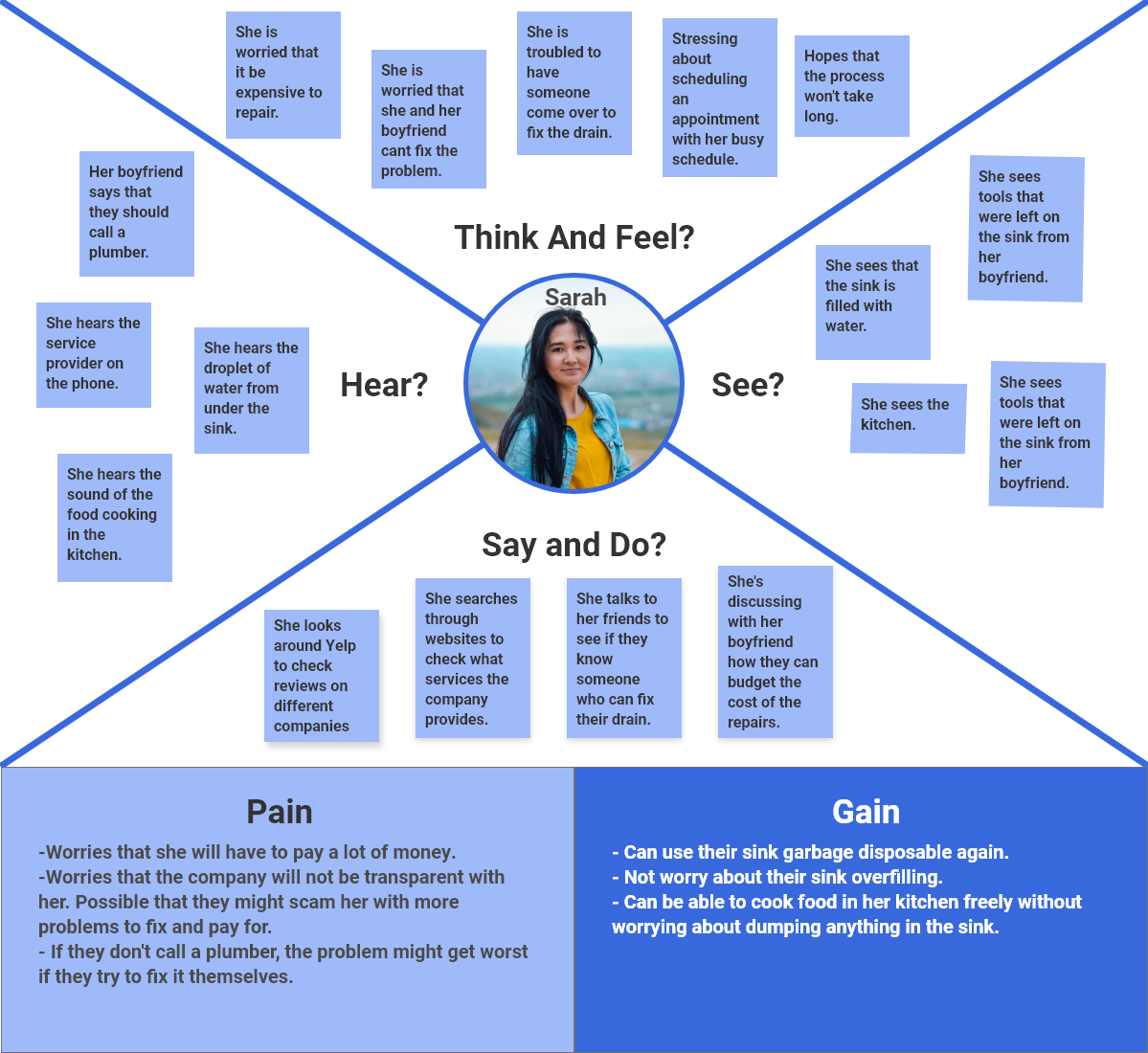
After creating the empathy map, we took a deep dive into our target user. We wanted to look into what issues she would face living with her boyfriend in a small apartment in San Francisco, CA. Living in the Bay Area, it's already hard for young millennials to afford an apartment. We wanted to focus on how budgeting on needing repairs can reflect on her trust in plumbing services.

“I want to be able to find an affordable and reliable plumber to repair my sink. I would hope that the plumber will be transparent about the service that they provide.”
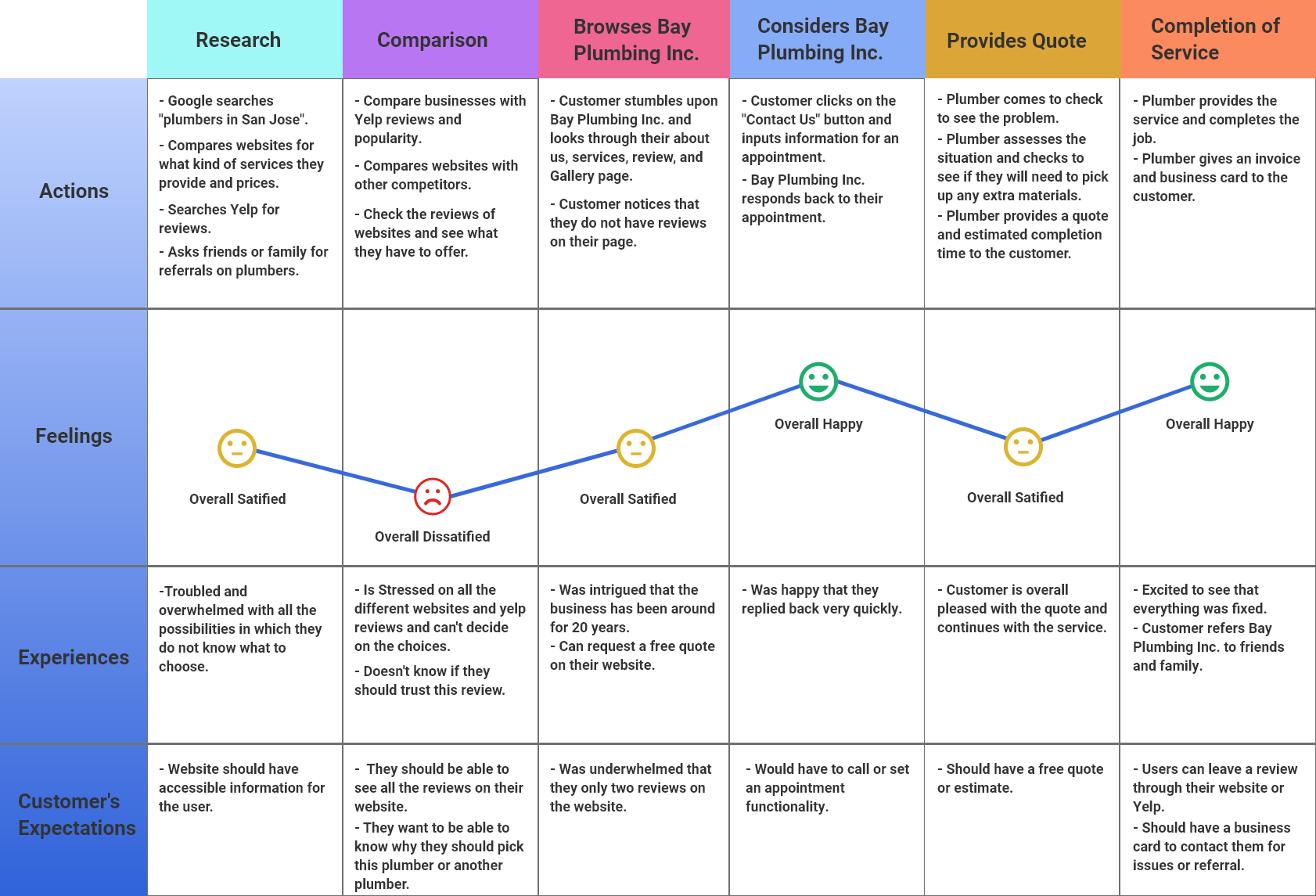
Taking the example of Sarah Do, we looked into the idea of how she would interact with the Bay Plumbing Inc. website. Based on her frustrations in looking for a cost-efficient and trustworthy plumber, she goes through a series of feelings and experiences.
The customer journey represents the key idea to what the website should help to new gain customers. By giving a sense of trust to the user, they can then refer to their friends and family about the service they received from Bay Plumbing Inc.
After reflecting on the research we gather thus far, we want to curate a website that represents the ideal action the user would take. We want to see the challenges in the customer journey and usability testing to reflect what issues we noticed on the website.
By analyzing the data, we concluded that Bay Plumbing Inc. needs to emphasize trust to their customers. To gain potential new clients, we need to emphasize reviews the customers give after completing a service by redesigning their website.
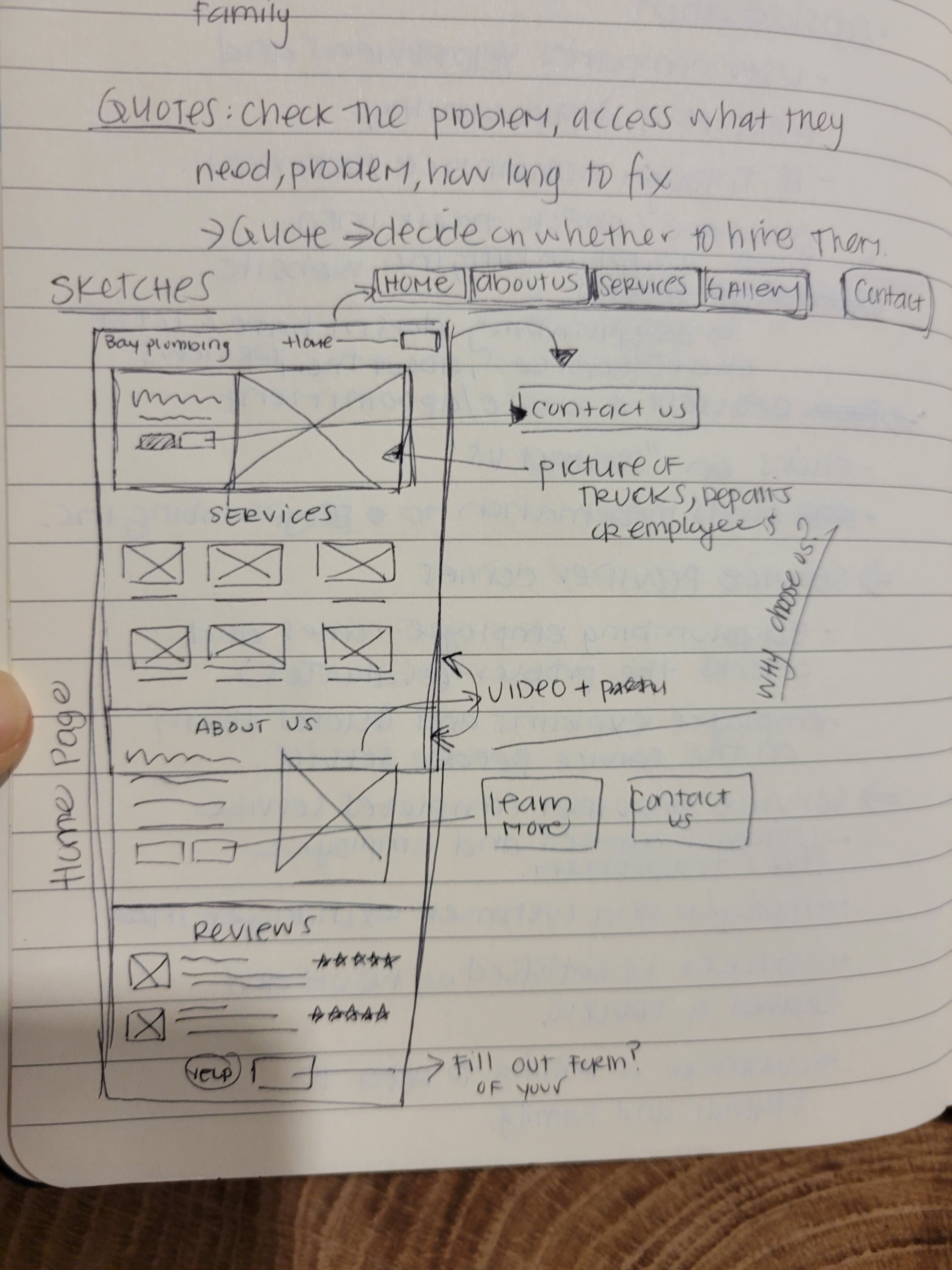
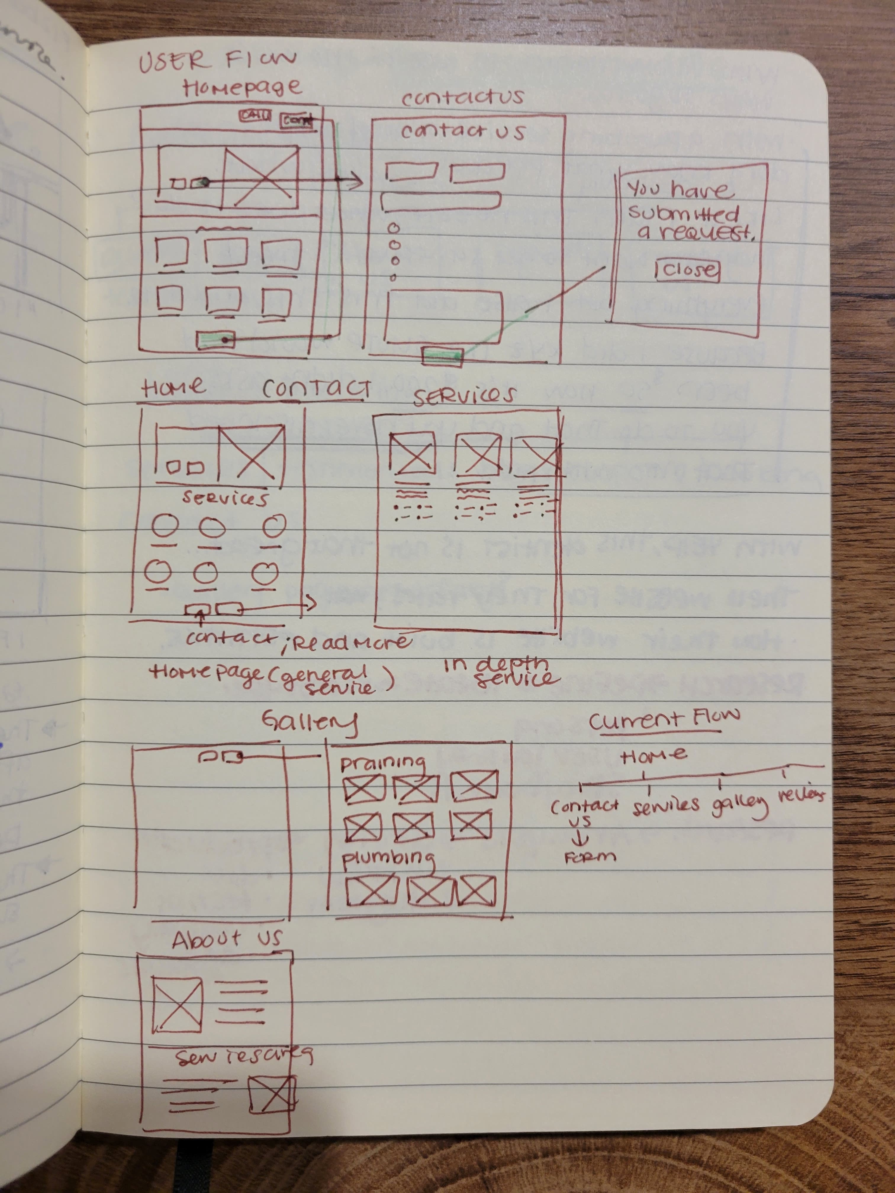
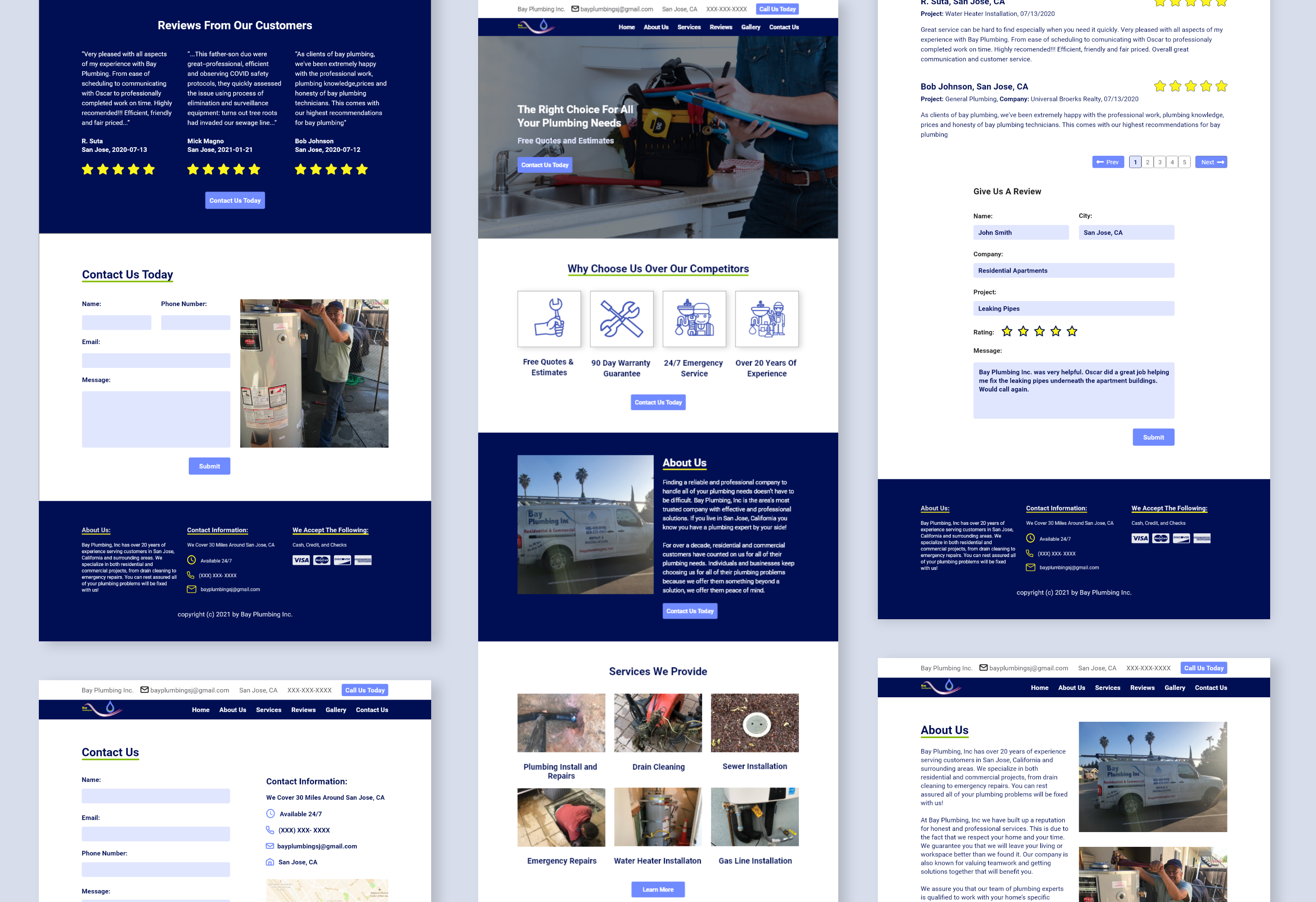
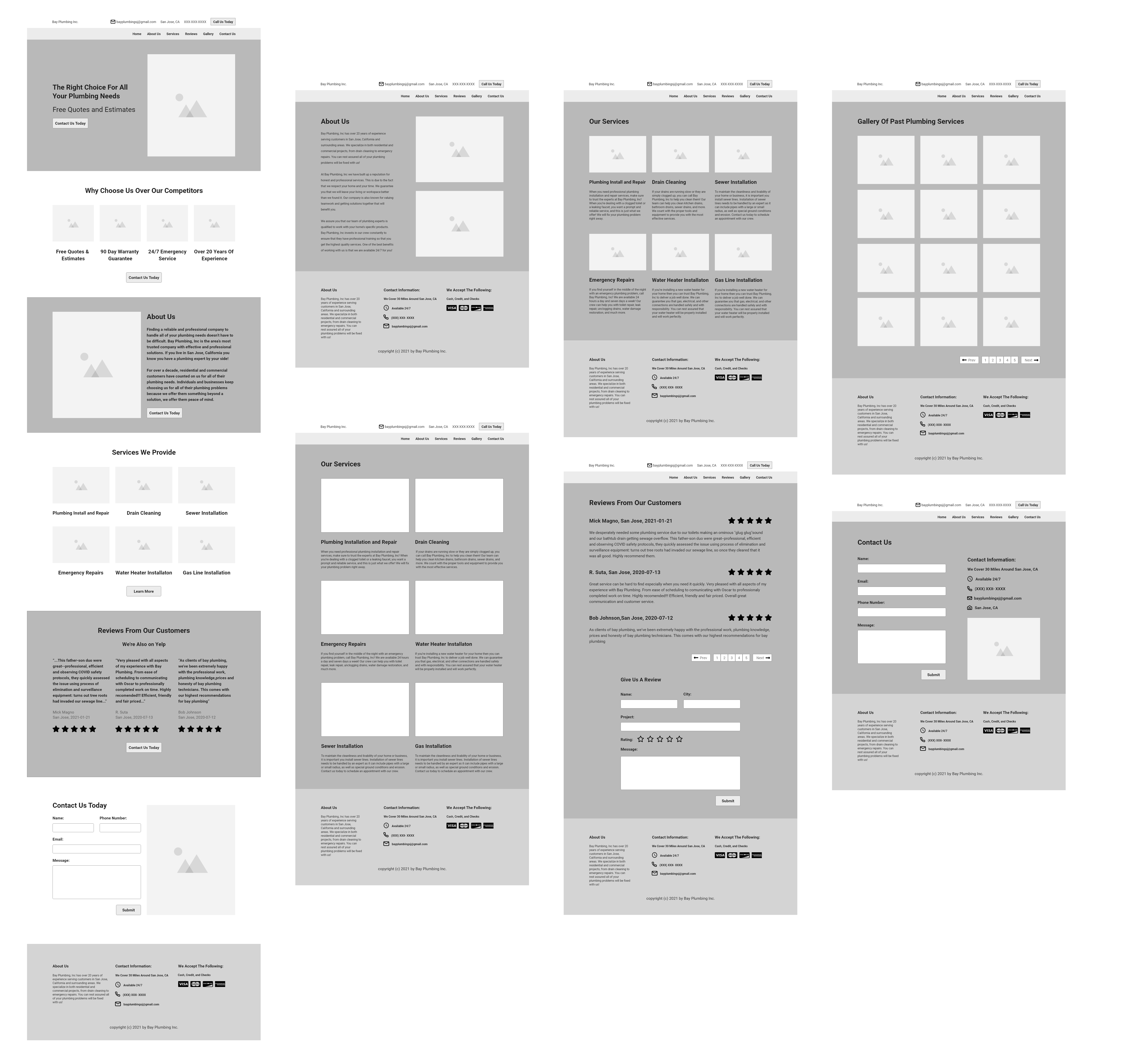
For the low-fidelity designs, I wanted to make more of a drastic change on the home page. The home page is the first page that the user sees. I added the most relevant information on the top of the page to entice the user. The remaining pages had subtle changes indicated from the usability testing and the ideation phase.
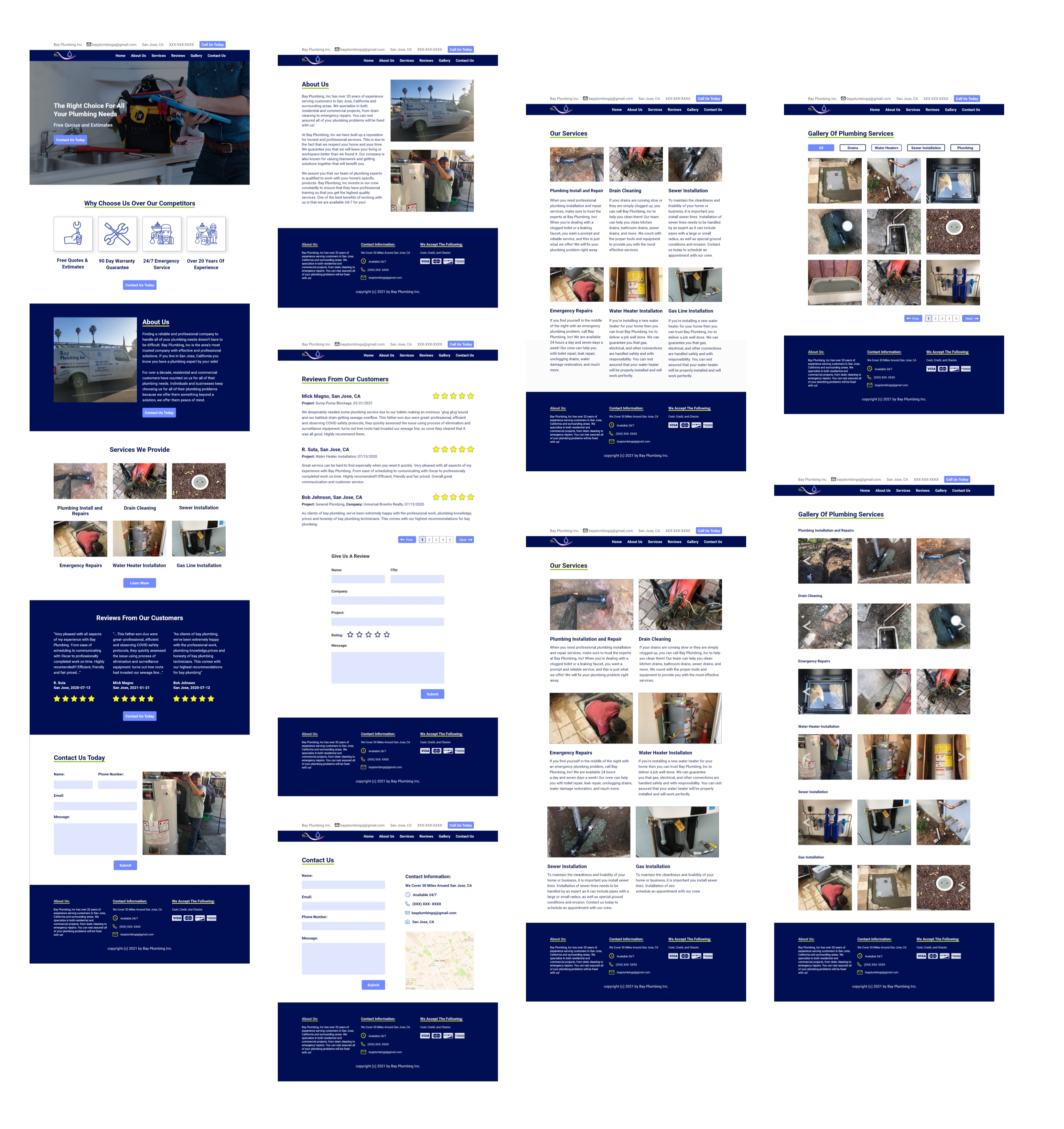
After completing the final design, I decided to test this with five users. We wanted to see if the changes made would suffice and how they compared to the old website.
Working on this project was a great insight on how to work with a client. They did not have many expectations working on this collaboration due to not maintaining the website often. After completing the project, the website redesign exceeded his expectations. He would hope to get this design implemented. Also, when I was reviewing the usability testing and interviews, it made sense that trust is valuable to the customers. Adding the reviews on the home page or adding an image of the business can change a customer's perspective. Adding changes to the website isn't the only way to gain more customers. It is up to the business to put in the effort to promote their website and ask customers to review their business.
Send a message!